Professor Robert Beatty
Estimated Time: 30-40 minutes
Databook created by: Rucha Kelkar, Harry Li, Elias Saravia
Modified by: Ariana Ghimire
Today we will be examining a dataset (ie. a table) and a few graphs on the MRSA bacterial infection. This notebook will challenge you to analyze data and use your knowledge of immunity and disease to form conclusions about MRSA. The notebook will also serve as a gentle introduction to Jupyter Notebooks (the platform you are currently using) and Python (a coding language).
Table of Contents
1. Intro to Jupyter 
This webpage is a Jupyter Notebook. Jupyter Notebooks run on the Python coding language and provides an interactive interface for students. We will use this notebook to analyze a dataset on MRSA bloodstream infections in California hospitals. Jupyter Notebooks are composed of both regular text and code cells. Code cells have a gray background. In order to run a code cell, click the cell and press Shift + Enter while the cell is selected or hit the ▶| Run button in the toolbar at the top. You can also save your work using the button on the top left hand corner.
An example of a code cell is shown below. The contents of this cell set up the notebook by importing pre-written Python packages that we will be using to read in, clean, analyze, and model our data. Run it, and once it is done, you should see “Done!” printed underneath the cell.
## DO NOT DELETE ANYTHING IN THIS CELL ##

# import utilities
from otter import Notebook
import numpy as np
import pandas as pd

print("Done!")
1.1 Types of Cells
Text Cells
Text cells (like this one) can be edited by double-clicking on them. They’re written in a simple format called Markdown to add formatting and section headings. You don’t need to learn Markdown, but know the difference between Text Cells and Code Cells.
Code Cells
Other cells contain code in the Python 3 language. Don’t worry -- you are not expected to write your own code for this notebook. Be sure to review, however, how to run a code cell!
Running Cells
“Running a cell” is equivalent to pressing “Enter” on a calculator once you’ve typed in the expression you want to evaluate: it produces an output. When you run a text cell, it outputs clean, organized writing. When you run a code cell, it computes all of the expressions you want to evaluate, and can output the result of the computation.
To run the code in a code cell, first click on that cell to activate it. It’ll be highlighted with a little green or blue rectangle. Next, you can either press the ▶| Run button above or press Shift + Return or Shift + Enter. This will run the current cell and select the next one.
For this class, you are not expected to write any code. You will be looking at plots generated by pre-written widgets. Your job is to write up your discussions and observations in the provided text cells.
How to save your work
Click on the leftmost icon in the tool bar (left of the plus icon). Alternatively, you can hit Ctrl+S on a PC or Command+Enter on a Mac.
1.2 Common errors and how to fix them
Accidentally deleted something in a cell?
Double click on that cell and press Ctrl+Z or Command+Z until you recover the deleted information. Otherwise, ask your GSI for help.
Getting a really long error message?
This could be a result of deleting code somewhere in the notebook in a code cell. If you remember which cell you deleted code from, double click on that cell and press Ctrl+Z or Command+Z until the code is as it was originally. Otherwise, raise your hand and ask for help from your GSI.
Getting the error ‘data_frame’ not present?
Make sure you have all of the relevant data files in your datahub home. Download the .csv files. Upload them into datahub in the folder where you see this notebook is stored.
Something is running for too long?
Try restarting the kernel. Sometimes Jupyter might be overloaded with the simplest of commands. Don’t worry, just save your work and restart the kernel.
Getting multiple plots in the widgets below?
This happened because you ran the line from datascience import * before working with the plot widgets. Try restarting the kernel and making sure you finish your work with the plot widgets BEFORE running the code cell with the aforementioned line.
1.3 Where to get help - Peer consultants
This class as well as the Division of Computing, Data Science, and Society has many resources to help you gain the most out of this assignment. The Division is hosting virtual data science office hours where you can drop by and ask for help with your notebook.
2. Introduction to Python 
Python is a popular programming language used by many; with Python, people create software to analyze quantitative data, develop websites, manage finances, etc. In Python, you can create expressions, functions, or variables that help you work with and understand the data you are using.
Example of an Expression
20+20Example of a Variable
An important type of variable is a string. Strings are sequences of characters, such as words or sentences. Strings are always surrounded by quotes.
# String
"Immunity"
Python Power!
Python is used all the time in the field of immunity and disease! Check out this Towards Data Science article, which models and simulates the spread of COVID-19 in the city of Yerevan. Using Python in this manner is really helpful because it outlines potential outcomes of this pandemic, without actually having to witness them.
3. Intro to MRSA 
MRSA, or methicillin resistant S. auereus, is one example of a bacteria that is highly resistant to antibiotics. It is usually a hospital acquired infection though it can also be spread through the community. A review of 15 studies showed that 13-74% of all S. aureus infections are MRSA. Managing this infection requires careful indentification of the MRSA strain and source of infection, proper choice of antibiotics, and robust prevention strategies. Active surveillance of personnel and disinfection of healthcare equipment and rooms is critical for prevention. For more information on MRSA, refer back to you professor’s lecture slides on this topic.
Discussion Question 1:
From what you know about MRSA, where do you think the majority of MRSA cases are located in California (urban counties vs. rural counties)? Why might this difference in population density be significant in the total number of MRSA infections?
REPLACE THIS TEXT WITH YOUR RESPONSE
[Note: double click on the cell, type in your response, and run the cell to save your work]
4. Intro to Data 
4.1 Reading in Data Sets
We will be analyzing is the Methicillin-resistant Staphylococcus aureus (MRSA) bloodstream infections (BSI) in California Hospitals data from the California Health and Human Services Agency.
California Health and Safety Code section 1288.55(a)(1) requires general acute care hospitals to report all cases of Methicillin-resistant Staphylococcus aureus (MRSA) bloodstream infections (BSI) identified in their facilities to the California Department of Public Health (CDPH). MRSA BSI data are submitted by hospitals to the Centers for Disease Control and Prevention National Healthcare Safety Network (NHSN). CDPH downloads California hospital MRSA BSI data from NHSN and analyzes the data to describe prevention progress in an annual public report of healthcare-associated infections. CDPH publishes annual MRSA BSI data reported by each California hospital in the datasets below.
Run the code cell below to load the data that we will be using for analysis.
# This cell will read in the necessary data sets. Run it and take a look at the dataframes below!
mrsa_merged = pd.read_csv('data/mrsa_merged.csv') #merged mrsa data
infec_pop_merge = pd.read_csv('data/infec_pop_merge.csv') #combined mrsa and population data

print("Done!")
4.2 Understanding the Data
Let’s visualize the raw data of MRSA Reports in 2013. Data is usually recorded in a dataset (or table) format with rows and columns. Each row represents a distinct observation and each column represents a feature/variable. Run the code cell below to see the dataset. You can scroll horizontally to see all of the columns that are included.
mrsa_2013_raw = pd.read_csv('data/mrsa-in-hospitals-2013.csv') #raw data
mrsa_2013_raw.head()
Shown above are the first five rows of the the data table. As you can see, there are a lot of columns as well as a lot of missing information in some of the columns. We have cleaned the data for you by removing any unncessary features and renaming the columns to make their purpose more clear. Run the code cell below to see the cleaned data set from MRSA Reports in 2013 below.
mrsa_2013 = pd.read_csv('data/mrsa_2013.csv') #cleaned data
mrsa_2013.head()
4.3 Breaking down the table
4.3.1 Rows
Let’s take a look at the first row of the dataset for MRSA Reports in 2013.
mrsa_2013.take([0])This particular row in our data represents a 2013 report representing the number of MRSA infections recorded in the Adventist Medical Center, Reedley in the Fresno County.
Therefore, in general, every row in our dataset represents a distinct MRSA report from a California hospital in 2013.
Try analyzing another row, just change the number 0 in the above code cell to see that numbered row. Since there are only 352 rows in our table, be sure your number is less than 352.
4.3.2. Columns
Run the code cell below to see the list of the columns in our dataset.
mrsa_2013.columns.tolist()Take a look at the columns names of the table listed above. Most of the columns should be pretty self-explanatory. For those that aren’t,
HAI: Hospital Acquired Infection. This refers to MRSA infections in hospital patients only.
Facility1: the name of the specific medical center/hospital.
Facility1_ID: a unique number identifier for the medical facility.
Discussion Question 2:
Of the questions we asked about MRSA, which are actually answerable given this dataset? Which questions could be answerable with a different dataset? And which would be hard to answer with the data we gave you?
REPLACE THIS TEXT WITH YOUR RESPONSE
[Note: double click on the cell, type in your response, and run the cell to save your work]
5. Comparing Infection Rates Over Time 
Previously, we were looking at the MRSA infections in hospitals in 2013. Now, we combined multiple datasets for MRSA Reports from 2013 - 2018. Our goal in analyzing this dataset is to see how the infection rates have changed over time across counties.
Use the plot widget to answer the discussion question below. Run the code cell below and toggle through the drop-down menu to look at infection counts for different counties.
from widgets import infection_rates_per_county
infection_rates_per_county()
Discussion Question 3:
Choose one urban county (e.g. Los Angeles) and one rural county (e.g. Sonoma) to evaluate. What trends can you identify? What outliers do you see? Make a general statement on how MRSA infections have changed over time in these two counties.
REPLACE THIS TEXT WITH YOUR RESPONSE
[Note: double click on the cell, type in your response, and run the cell to save your work]
6. Comparing County Infection Rates with County Populations 
6.1 Infection rate by county per year
We can use the same data to compare the infection rates based on the population within a county. A question we can ask is: What is the trend over the years of total population against infection counts?
The following code cell displays a widget that plots a regression (best fit) line over these two variables. See if you can catch an interesting trend.
from widgets import population_v_infection_by_county
population_v_infection_by_county()
Discussion Question 4:
Look at the same two urban and rural counties that you chose for the previous question. What information can you draw from the above graph for those two counties?
REPLACE THIS TEXT WITH YOUR RESPONSE
[Note: double click on the cell, type in your response, and run the cell to save your work]
6.2 Infection rate across counties by year
The last portion of our analysis will be to look at infection counts across all counties each year. We calculate a “best fit” regression line to estimate the rate of infection.
Run the code cell below to load the widget. Feel free to select different years to see the change in slopes.
from widgets import population_vs_infection_by_year
population_vs_infection_by_year()
Discussion Question 5:
Select different years in the graph above. What do you notice about the slope across different years? What information can you draw from the graph above?
REPLACE THIS TEXT WITH YOUR RESPONSE
[Note: double click on the cell, type in your response, and run the cell to save your work]
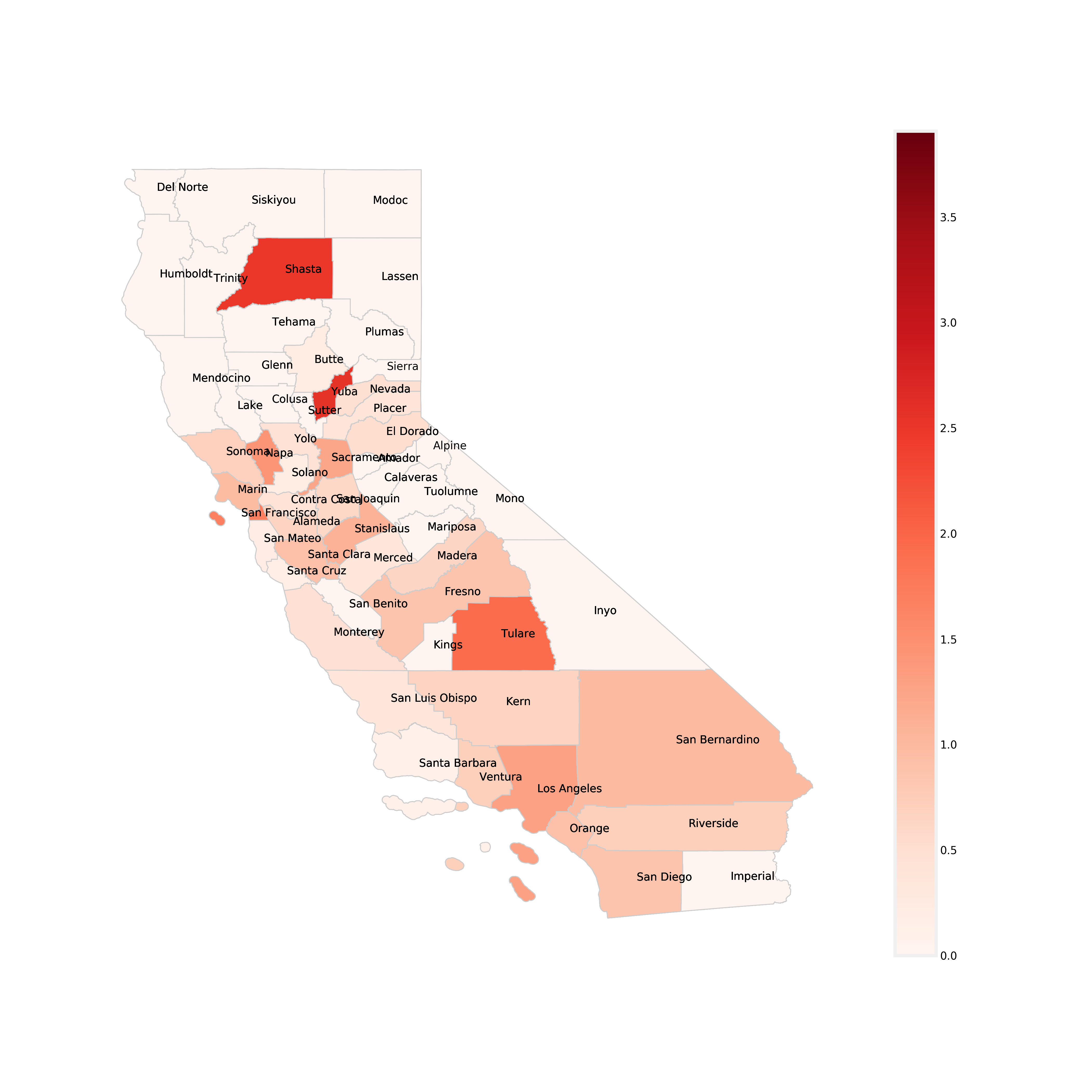
6.3 California Counties Colored by Infection Rate (number of infections/population)
We can also use maps to gain more insight from the data.
A choropleth map (from Greek χῶρος “area/region” and πλῆθος “multitude”) is a type of thematic map in which areas are shaded or patterned in proportion to a statistical variable that represents an aggregate summary of a geographic characteristic within each area, such as population density or per-capita income.
Below is a a chloropleth map, which is similar to a heat map where color schemes in areas communicate high values with bright colors and low values with darker colors. For example, a weather map shows high temperature in red and colder temperature in blue. This map shows each California County and the rate of infection per unit of population (100,000 people). The darker red the county, the higher its MRSA infection rate is. The colorbar on the right side of the map shows the range of infection rates. Take a look at the map below and use it to answer the discussion question below.
Discussion Question 6:
Having looked at the chloropleth map of California counties above, what trends/outliers do you see? Find your two chosen urban and rural counties from previous questions. Are the MRSA infection rates (denoted by color) consistent with what you originally thought? What would you say overall about the relationship between infection rates and population?
REPLACE THIS TEXT WITH YOUR RESPONSE
[Note: double click on the cell, type in your response, and run the cell to save your work]
[OPTIONAL] 7. Bonus Challenge 
BONUS CHALLENGE (for folks who have taken Data-8 or beyond): Our data sets also have variables we didn’t use, including population split into race and sex subcategories. Try to alter the given code in the file widgets.py OR write your own code to build new plots and compare two new variables. What patterns do you see?
Provided below is a table containing California Census population data. This data is grouped by Year and County. Each row contains information on the Total Population as well as subsets of each population by race and sex.
# import Data 8 python package
from datascience import *
# re-import necessary datasets so you can work with Data 8 Table commands.
mrsa_merged = Table.read_table('data/mrsa_merged.csv') #merged mrsa data
infec_pop_merge = Table.read_table('data/infec_pop_merge.csv') #combined mrsa and population data
census_bonus = Table.read_table('data/census_bonus.csv').group(["Year", "County"], sum)
census_bonus.show(5)Note: To insert more code cells to work in, click on this text once, select ‘Insert’ in the toolbar above and choose ‘Insert Cell Below’
WRITE YOUR OBSERVATIONS HERE
[Note: double click on the cell, type in your response, and run the cell to save your work]
8. Submit Your Work 
Run the code cell below convert your answers to the discussion question into a pdf. Be sure to follow instructions for submitting this assignment.
After running the cell, you can click
Download it here!to create a PDF.After running the cell, you can also right-click on
Download it here!then clickSave Link As...to save it as a PDF.
# run this cell to convert your work to a pdf for submission
Notebook.export("MRSA Data Analysis.ipynb", filter_type='tags')Data Science Opportunities
Data Science Modules: http://
Data Science Offerings at Berkeley: https://