# Initialize Otter
import otter
grader = otter.Notebook("MRSA Data Analysis.ipynb")Estimated Time: 30-40 minutes
Databook created by: Rucha Kelkar, Harry Li, Elias Saravia, Ariana Ghimire
About This Notebook
Today we will be examining a dataset (a table of data) and several graphs related to Methicillin-resistant Staphylococcus aureus (MRSA), a bacterial infection that can cause serious illness. In this notebook, you’ll analyze patterns in the data and use your knowledge of immunity and infectious disease to draw conclusions about how MRSA spreads and affects populations.
Because this version of the notebook is designed for students who already have some programming experience, we’ll also use this as an opportunity to connect basic coding and data skills to clinical questions. You’ll work with Jupyter Notebooks (the platform you are currently using) and Python (a programming language) to explore the dataset, interpret visualizations, and practice thinking like both a clinician and a data scientist.
While the notebook will briefly review key tools, it will also give you a bit more independence to explore the data and develop your own insights.
## DO NOT DELETE ANYTHING IN THIS CELL ##
%pip install otter-grader numpy pandas datascience matplotlib ipywidgets notebook
# import utilities
import os
from pathlib import Path

from otter import Notebook
import numpy as np
import pandas as pd
from datascience import *
import matplotlib.pyplot as plt
import ipywidgets as widgets

# Make relative data-file paths work even if Jupyter starts in the project root.
for candidate_dir in [Path.cwd().resolve(), *Path.cwd().resolve().parents]:
    if (candidate_dir / "mrsa_merged.csv").exists():
        os.chdir(candidate_dir)
        break
else:
    raise FileNotFoundError(
        "Could not locate 'mrsa_merged.csv'. Open the notebook from the project folder or the 'mrsa' folder."
    )

widgets.IntSlider()
print("Done!")
2. Intro to MRSA 
MRSA, or methicillin resistant S. aureus, is one example of a bacteria that is highly resistant to antibiotics. It is usually a hospital acquired infection though it can also be spread through the community. A review of 15 studies showed that 13-74% of all S. aureus infections are MRSA. For future nurses, this matters because MRSA infections change the kinds of precautions you take, the antibiotics that are ordered, and how closely you monitor patients for complications. Managing this infection requires careful indentification of the MRSA strain and source of infection, proper choice of antibiotics, and robust prevention strategies. Active surveillance of personnel and disinfection of healthcare equipment and rooms is critical for prevention.
Discussion Question 1:
From what you know about MRSA and our class content, where do you think the majority of MRSA cases are located in California (urban counties vs. rural counties)?
How could a difference in population density affect the total number of MRSA infections?
What possible downstream connections can be made in relation to the workload for nurses and other healthcare staff?
Type your answer here, replacing this text.
REPLACE THIS TEXT WITH YOUR RESPONSE
[Note: double click on the cell, type in your response, and run the cell to save your work]
3. Intro to Data 
3.1 Reading in Data Sets
We will be analyzing is the Methicillin-resistant Staphylococcus aureus (MRSA) bloodstream infections (BSI) in California Hospitals data from the California Health and Human Services Agency.
California Health and Safety Code section 1288.55(a)(1) requires general acute care hospitals to report all cases of Methicillin-resistant Staphylococcus aureus (MRSA) bloodstream infections (BSI) identified in their facilities to the California Department of Public Health (CDPH). MRSA BSI data are submitted by hospitals to the Centers for Disease Control and Prevention National Healthcare Safety Network (NHSN). CDPH downloads California hospital MRSA BSI data from NHSN and analyzes the data to describe prevention progress in an annual public report of healthcare-associated infections. CDPH publishes annual MRSA BSI data reported by each California hospital in the datasets below.
Run the code cell below to load the data that we will be using for analysis.
# This cell will read in the necessary data sets. Run it and take a look at the dataframes below!
mrsa_merged = pd.read_csv('mrsa_merged.csv') #merged mrsa data
infec_pop_merge = pd.read_csv('infec_pop_merge.csv') #combined mrsa and population data

print("Done!")
Done!
3.2 Understanding the Data
Let’s visualize the raw data of MRSA Reports in 2013. Data is usually recorded in a dataset (or table) format with rows and columns. Each row represents a distinct observation and each column represents a feature/variable. Run the code cell below to see the dataset. You can scroll horizontally to see all of the columns that are included.
mrsa_2013_raw = pd.read_csv('mrsa-in-hospitals-2013.csv') #raw data
mrsa_2013_raw.head()Shown above are the first five rows of the the data table. As you can see, there are a lot of columns as well as a lot of missing information in some of the columns. We have cleaned the data for you by removing any unncessary features and renaming the columns to make their purpose more clear. Run the code cell below to see the cleaned data set from MRSA Reports in 2013 below.
mrsa_2013 = pd.read_csv('mrsa_2013.csv') #cleaned data
mrsa_2013.head()3.3 Breaking down the table
3.3.1 Rows
Let’s take a look at the first row of the dataset for MRSA Reports in 2013.
mrsa_2013.take([0])This particular row in our data represents a 2013 report representing the number of MRSA infections recorded in the Adventist Medical Center, Reedley in the Fresno County.
Therefore, in general, every row in our dataset represents a distinct MRSA report from a California hospital in 2013.
Try analyzing another row, just change the number 0 in the above code cell to see that numbered row. Since there are only 352 rows in our table, be sure your number is less than 352.
3.3.2. Columns
Run the code cell below to see the list of the columns in our dataset.
mrsa_2013.columns.tolist()['Year',
'State',
'HAI',
'Facility1',
'Facility1_ID',
'County',
'Infection_Count',
'Num_patients']Take a look at the columns names of the table listed above. Most of the columns should be pretty self-explanatory. For those that aren’t,
HAI: Hospital Acquired Infection. This refers to MRSA infections in hospital patients only.
Facility1: the name of the specific medical center/hospital.
Facility1_ID: a unique number identifier for the medical facility.
Discussion Question 2:
Of the questions we asked about MRSA, which are actually answerable given this dataset? Which questions could be answerable with a different dataset? And which would be hard to answer with the data we gave you?
Type your answer here, replacing this text.
REPLACE THIS TEXT WITH YOUR RESPONSE
[Note: double click on the cell, type in your response, and run the cell to save your work]
4. Comparing Infection Rates Over Time 
Previously, we were looking at the MRSA infections in hospitals in 2013. Now, we combined multiple datasets for MRSA Reports from 2013 - 2018. Our goal in analyzing this dataset is to see how the infection rates have changed over time across counties.
Use the plot widget to answer the discussion question below. Run the code cell below and toggle through the drop-down menu to look at infection counts for different counties.
from widgets import infection_rates_per_county
%matplotlib inline
infection_rates_per_county()Discussion Question 3:
Choose one urban county (e.g. Los Angeles) and one rural county (e.g. Sonoma) to evaluate. What trends can you identify? What outliers do you see? Make a general statement on how MRSA infections have changed over time in these two counties.
Type your answer here, replacing this text.
REPLACE THIS TEXT WITH YOUR RESPONSE
[Note: double click on the cell, type in your response, and run the cell to save your work]
5. Comparing County Infection Rates with County Populations 
5.1 Infection rate by county per year
We can use the same data to compare the infection rates based on the population within a county. A question we can ask is: What is the trend over the years of total population against infection counts?
The following code cell displays a widget that plots a regression (best fit) line over these two variables. See if you can catch an interesting trend.
from widgets import population_v_infection_by_county
population_v_infection_by_county()Discussion Question 4:
Look at the same two urban and rural counties that you chose for the previous question. What information can you draw from the above graph for those two counties?
Type your answer here, replacing this text.
REPLACE THIS TEXT WITH YOUR RESPONSE
[Note: double click on the cell, type in your response, and run the cell to save your work]
5.2 Infection rate across counties by year
The last portion of our analysis will be to look at infection counts across all counties each year. We calculate a “best fit” regression line to estimate the rate of infection.
Run the code cell below to load the widget. Feel free to select different years to see the change in slopes.
from widgets import population_vs_infection_by_year
population_vs_infection_by_year()Discussion Question 5:
Select different years in the graph above. What do you notice about the slope across different years? What information can you draw from the graph above?
Type your answer here, replacing this text.
REPLACE THIS TEXT WITH YOUR RESPONSE
[Note: double click on the cell, type in your response, and run the cell to save your work]
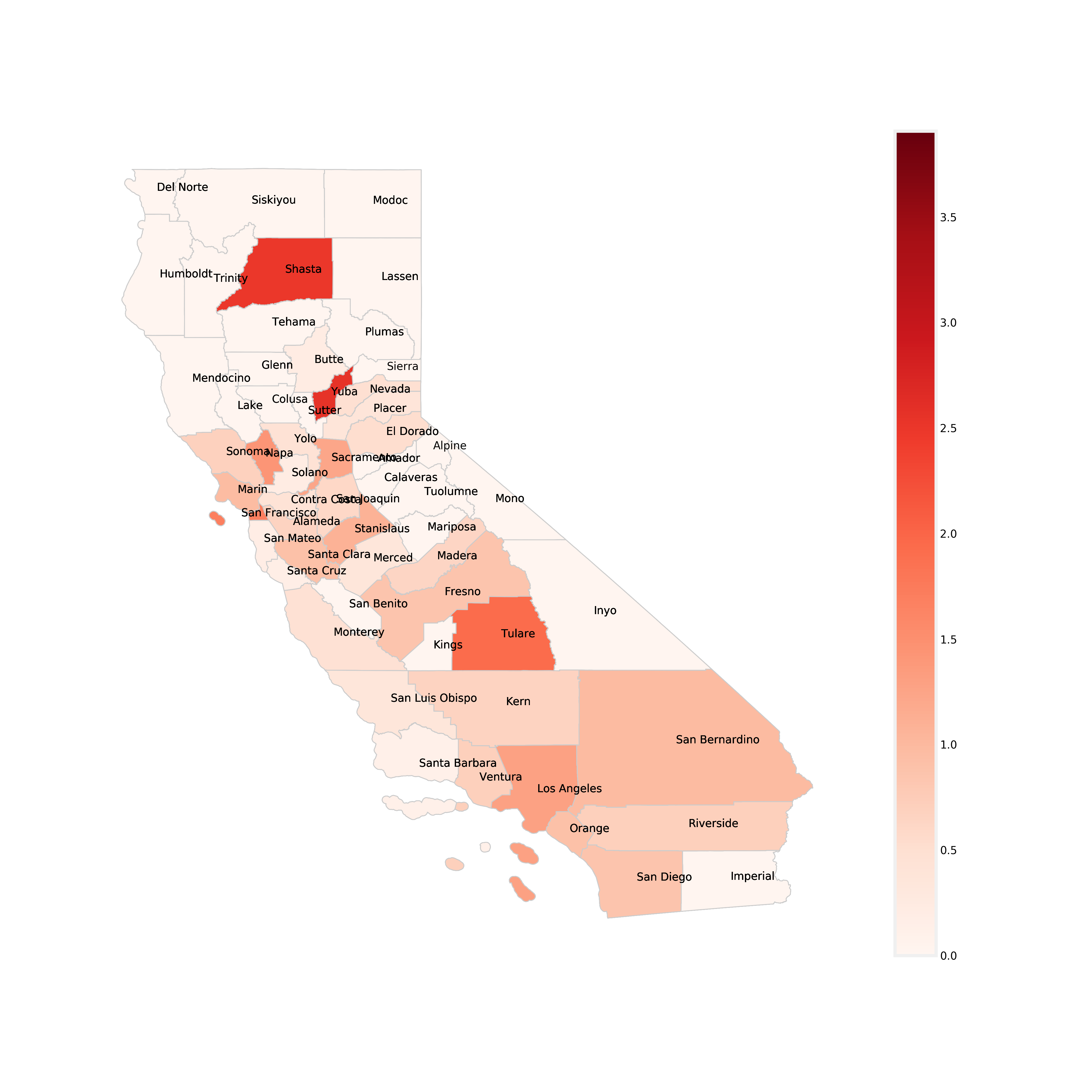
5.3 California Counties Colored by Infection Rate (number of infections/population)
We can also use maps to gain more insight from the data.
A choropleth map (from Greek χῶρος “area/region” and πλῆθος “multitude”) is a type of thematic map in which areas are shaded or patterned in proportion to a statistical variable that represents an aggregate summary of a geographic characteristic within each area, such as population density or per-capita income.
Below is a a chloropleth map, which is similar to a heat map where color schemes in areas communicate high values with bright colors and low values with darker colors. For example, a weather map shows high temperature in red and colder temperature in blue. This map shows each California County and the rate of infection per unit of population (100,000 people). The darker red the county, the higher its MRSA infection rate is. The colorbar on the right side of the map shows the range of infection rates. Take a look at the map below and use it to answer the discussion question below.
Discussion Question 6:
Having looked at the chloropleth map of California counties above, what trends/outliers do you see? Find your two chosen urban and rural counties from previous questions. Are the MRSA infection rates (denoted by color) consistent with what you originally thought? What would you say overall about the relationship between infection rates and population?
Type your answer here, replacing this text.
REPLACE THIS TEXT WITH YOUR RESPONSE
[Note: double click on the cell, type in your response, and run the cell to save your work]
6. Exploring Census Data by County, Year, and Race 
Our datasets also include California Census population data. Each row contains:
The year and county.
The total population.
Breakdowns of the population by race and sex.
In this section, you will:
Review how a group by operation works.
Look at a table thats grouped by year and county.
Use simple code (no widgets) to:
Focus on one county across years.
Make at least one plot that compares total population or a specific race group over time.
Interpret what you see from a public‑health / nursing perspective.
6.1 Quick review: what does group by mean?
A group by operation answers questions like:
“What is the total MRSA infection count per year?”
“What is the total population per county?”
In plain language, you will:
Choose a column (or columns) to group by (for example,
Year).Combine all rows that share the same values in those columns.
Apply a summary function (often
sum,mean, orcount) to the numeric columns.
In the code below, fill in the ... with the choices from 1-3 above. Once you have gone through this section once, feel free to mix up variable/operation.
HINT:
census_bonus = Table.read_table('census_bonus.csv').group(['Year','County'],sum)
census_bonus = Table.read_table('census_bonus.csv').group([...],...)
census_bonus.show(5)
---------------------------------------------------------------------------
TypeError Traceback (most recent call last)
Cell In[93], line 1
----> 1 census_bonus = Table.read_table('census_bonus.csv').group([...],...)
2 census_bonus.show(5)
File ~/Desktop/ecc-biology/.venv/lib/python3.14/site-packages/datascience/tables.py:1553, in Table.group(self, column_or_label, collect)
1550 # Assume that a call to group with a list of labels is a call to groups
1551 if _util.is_non_string_iterable(column_or_label) and \
1552 len(column_or_label) != self._num_rows:
-> 1553 return self.groups(column_or_label, collect)
1555 self = self.copy(shallow=True)
1556 collect = _zero_on_type_error(collect)
File ~/Desktop/ecc-biology/.venv/lib/python3.14/site-packages/datascience/tables.py:1638, in Table.groups(self, labels, collect)
1635 if not _util.is_non_string_iterable(labels):
1636 return self.group(labels, collect=collect)
-> 1638 collect = _zero_on_type_error(collect)
1639 columns = []
1640 labels = self._as_labels(labels)
File ~/Desktop/ecc-biology/.venv/lib/python3.14/site-packages/datascience/tables.py:5830, in _zero_on_type_error(column_fn)
5828 return column_fn
5829 if not callable(column_fn):
-> 5830 raise TypeError('column functions must be callable')
5831 @functools.wraps(column_fn)
5832 def wrapped(column):
5833 try:
TypeError: column functions must be callable6.2 Guided exploration with census_bonus
We’ll walk through some specific steps.
Step 1 – Pick one county and look at its rows
Use the code cell below to filter to one of the counties you were reviewing above (for example, Alameda County) across years and display the first few rows. Fill in the county name in the code below.
# Step 1: filter to a single county (you can change the name)
county_name = 'Alameda County'  # note: match the exact spelling from the table
census_county = census_bonus.where('County', county_name)
census_county.show(5)
---------------------------------------------------------------------------
NameError Traceback (most recent call last)
Cell In[11], line 3
1 # Step 1: filter to a single county (you can change the name)
2 county_name = 'Alameda County' # note: match the exact spelling from the table
----> 3 census_county = census_bonus.where('County', county_name)
4 census_county.show(5)
NameError: name 'census_bonus' is not definedStep 2 – Plot total population vs. year
Use the built‑in Table.plot method to make a simple line plot of total population over time for that county.
# Step 2: plot total population vs year for that county
%matplotlib inline
census_county.plot('Year', 'Total_Population sum')
---------------------------------------------------------------------------
NameError Traceback (most recent call last)
Cell In[12], line 3
1 # Step 2: plot total population vs year for that county
2 get_ipython().run_line_magic('matplotlib', 'inline')
----> 3 census_county.plot('Year', 'Total_Population sum')
NameError: name 'census_county' is not definedStep 3 – Focus on one race group
Choose one of the race columns (for example, Asian Male sum + Asian Female sum) and make a plot that shows how that sub‑population changes over time. Fill in the ... in the code below with the race column names. Look back at the table to see the specific column names that should fill in the ‘....’
If you are having trouble there is an example of what the code would look like for the Asian population if you click on ‘HINT’ below.
HINT:
asian_total = census_county.select('Year', 'Asian Male sum', 'Asian Female sum')

asian_total = asian_total.with_column(
    'Asian total',
    asian_total.column('Asian Male sum') + asian_total.column('Asian Female sum')
)

asian_total.select('Year', 'Asian total').plot('Year')
plt.show()
# Step 3: plot one race group vs year
race_total = census_county.select('Year', '....', '.....')
race_total = race_total.with_column(
'race total',
race_total.column('....') + race_total.column('...')
)
race_total.select('Year', 'race total').plot('Year')
plt.show()---------------------------------------------------------------------------
NameError Traceback (most recent call last)
Cell In[12], line 2
1 # Step 3: plot one race group vs year
----> 2 race_total = census_county.select('Year', '....', '.....')
3 race_total = race_total.with_column(
4 'race total',
5 race_total.column('....') + race_total.column('...')
6 )
8 race_total.select('Year', 'race total').plot('Year')
NameError: name 'census_county' is not defined6.4 Compare multiple whole-race groups
Each line is one race total (male + female combined), not separate sex columns. Use the checkboxes to select multiple races and overlay them on the same graph.
The graph also includes one extra dashed black line showing the overall average across all races for the selected county.
import importlib
import widgets

importlib.reload(widgets)
widgets.census_race_multiselect_widget()Discussion Question 7:
Using the whole-race group plot above, choose one county and describe how different racial groups change over time.
What demographic trends or population shifts do you notice in your chosen county?
How might demographic changes and population density in a county influence healthcare resource planning, community health needs, or the spread and management of infectious diseases like MRSA?
Type your answer here, replacing this text.
REPLACE THIS TEXT WITH YOUR RESPONSE
[Note: double click on the cell, type in your response, and run the cell to save your work]
Submission Instructions
Before downloading your notebook as a PDF, make sure you have:
Run all cells in order from top to bottom so all your code outputs, plots, and written responses are visible.
Saved your notebook by clicking File → Save Notebook (or pressing
Cmd + S/Ctrl + S).
How to Download as PDF in JupyterLab / JupyterHub:
Save and Export Notebook As PDF
In the top menu bar, click File.
Hover over Save and Export Notebook As... (or Download as depending on your Jupyter version).
Click PDF (or PDF via LaTeX / HTML).
Your PDF file will download automatically to your computer’s Downloads folder.
Turn In Your Assignment:
Once you have downloaded your PDF, submit it to Canvas under the corresponding assignment.
Submission
Make sure you have run all cells in your notebook in order before running the cell below, so that all images/graphs appear in the output. The cell below will generate a zip file for you to submit. Please save before exporting!
# Save your notebook first, then run this cell to export your submission.
grader.export(run_tests=True)