# Initialize Otter
import otter
grader = otter.Notebook("proj1.ipynb")
Project 1
Created and developed by Brandon Concepcion, James Geronimo, and Zcjanin Ollesca with assistance and supervision by Jonathan Ferrari, Professor Audrey Lin, Professor Solomon Russell, and Professor Eric Van Dusen as part of our work with UC Berkeley’s College of Computing, Data Science and Society as well as El Camino College
CalEnviroScreen: Exploring Environmental Justice Through Data
Welcome!
In this project we’ll be exploring data from CalEnviroScreen, a tool developed by the California Office of Environmental Health Hazard Assessment to identify communities that are most affected by pollution and other environmental burdens. This dataset weaves together environmental, health, and socioeconomic indicators, offering a powerful opportunity to sharpen your data science skills while uncovering insights about communities across the state of California.
This assignment will walk you through some of the early stages of the Data Science Lifecycle, such as:
Data cleaning and exploration
Basic tabular analysis using Pandas
Data visualization techniques
While the primary goal of this project is to develop your fluency with the Pandas library, we also hope to ehnance your intuition as you think more like a data scientist! And to better simulate the kinds of challenges you’ll encounter in real-world scenarios, we’ll be working with a modified, messy version of the original CalEnviroScreen data.
That’s pretty much all for introductions, so if you’re ready: Be sure to strap on your helmets, pull up your bootstraps, and keep your hands in the vehicle at all times....it’s going to be a fun ride!
Import Statements
Run the cell below to import all of the necessary libraries for this assignment!
import pandas as pd
import numpy as np
import matplotlib.pyplot as plt
import seaborn as sns
import seaborn as sns
import plotly.express as px
import plotly.io as pio
from utils import *
pio.renderers.default = "svg"
pd.set_option("display.max_columns", None)
1. Introduction
To give some context, the California Communities Environmental Health Screening Tool, or CalEnviroScreen, is a statewide data tool developed by California’s Office of Environmental Health Hazard Assessment. It brings together environmental, health, and socioeconomic data to identify communities that are especially vulnerable to pollution and environmental health risks.
Each census tract is “a small, relatively permanent subdivision of a county” designed to represent a neighborhood-sized population, and is assigned a score based on a combination of environmental and socioeconomic indicators. These scores allow for comparisons across regions, and are used by both policymakers and researchers alike to guide decisions around resource allocation, environmental regulations, and public health interventions.
1.1 Reading in CalEnviroScreen Data
To start exploring the CalEnviroScreen dataset, run the cell below to load the data into your notebook. Do not modify any lines.
# Read in the data
ces = pd.read_csv('modified_cal_enviro_screen.csv')
ces.head()
Below are some other properties about our data:
Each row represents a census tract level
Our columns consist of environmental factors and demographic characteristics, such as pollution burden indicators and other population data
Properties + Sanity Checks
Before diving into analysis, it’s always a good idea to take a step back and explore some basic properties of the dataset. Some things to consider could be: the number of rows and columns, the structure of the data (also known as its schema), and the types of variables we’re working with. Familiarizing yourself with the dataset in this way will help you build an early understanding of what questions you can ask, and how you might begin to answer them. Much of the heavy lifting has already been done for you in the cells below.
Let’s start by looking at the column names in our DataFrame. This will give us a quick overview of the different features available to us. We can use the .columns attribute of our DataFrame to do this:
# Run this cell
print(ces.columns)
It’s also helpful to run a few quick sanity checks to explore the initial properties of the data. Let’s also take a look at the data types of each column to better understand what kind of values we’re working with.
# Run this cell to return the data type of the first 10 columns of the DataFrame
ces.dtypes[:10]
You may have noticed that the CES 4.0 Score, which we would expect to be a float64 (a decimal), is currently listed as an object (in this case it’s pretty much being treated as a string). We’ll address this issue in a future section, so just keep it in mind for now, but this is a great example of why it’s important to always inspect your data early on: catching inconsistencies like this up front can save you from more complicated issues later in your analysis!
Unique Census Tracts
Let’s perform another sanity check — this time to confirm that each census tract in our dataset is unique. In simple terms, we want to make sure we aren’t seeing duplicate entries for the same tract.
According to the U.S. Census Bureau, there are approximately 8,057 census tracts across California. Let’s see how many are included in the version of the dataset we’re working with by running the cell below. Do not modify any lines.
# Just run this cell
cal_enviro_screen_shape = ces.shape
num_rows = cal_enviro_screen_shape[0]
num_columns = cal_enviro_screen_shape[1]

print(f"Our version of the CalEnviroScreen data has {num_rows} rows and {num_columns} columns")
Let’s check whether each row in our dataset corresponds to a unique census tract.
number_unique = ces["Census Tract"].nunique()
print(f"There are {number_unique} unique census tracts in our dataset!")
Great! Our dataset contains 8,305 unique census tracts, which matches the total number of rows. This confirms that each row represents a distinct census tract and that there are no duplicate entries!
Granularity
Now that we know each row represents a single, unique census tract, we can begin to think about the granularity of this dataset. Granularity refers to the level of detail captured in the data, or how specific each data point is.
A dataset with high granularity contains detailed, fine-grained records (ex. individual air quality readings, household income reports)
A dataset with low granularity contains more aggregated information (ex. average pollution levels by region, monthly income summaries)
Important Note: Granularity is a relative concept. Whether a dataset is considered high or low granularity entirely depends on the point of comparison. For instance, hospital-level summaries of patient outcomes are more detailed than national health statistics, but less detailed than individual patient records.
Question 1.1.: Relative to county or state-level data, how would you describe the granularity of the CalEnviroScreen dataset? Assign relative_granularity to an integer corresponding to the assumption.
Lower granularity, because it aggregates data across multiple regions.
Higher granularity, because it provides more detailed, localized data.
The same level of granularity as county and state-level data.
Granularity cannot be determined without individual-level data.
relative_granularity = ...grader.check("q11")Indicators and CES Score
Now that we understand the level of detail (or granularity) in our dataset, it’s important to get a sense of what is actually being measured. The CalEnviroScreen tool organizes its data into a set of indicators, specific metrics used to assess environmental burden and population vulnerability across communities.
According to the Indicators Overview provided by OEHHA:
“An indicator is a measure of either environmental conditions, in the case of pollution burden indicators, or health and vulnerability factors for population characteristic indicators.”
Each individual indicator is scored separately, and together they contribute to the overall CalEnviroScreen (CES) score. This number serves as a proxy for cumulative environmental vulnerability in a given census tract.
Higher CES scores indicate worse outcomes — meaning that communities with higher scores are more burdened by pollution and related stressors
Lower scores, on the other hand, suggest relatively less environmental risk
Question 1.2. Select one specific indicator from each of the four broad categories
Exposure Indicators
Environmental Effects Indicators
Sensitive Population Indicators
Socioeconomic Factor Indicators
For each selected indicator, provide a brief explanation that includes: What it represents, what it measures, and what its purpose is in the context of environmental vulnerability.
For a full list of these indicators, visit the CalEnviroScreen Indicators Overview and scroll to the bottom of the page.
Question 1.2.1. Find an Exposure Indicator and write a brief description as outlined above.
Type your answer here, replacing this text.
Question 1.2.2. Find an Environmental Effects Indicator and write a brief description as outlined above.
Type your answer here, replacing this text.
Question 1.2.3. Find an Exposure Indicator and write a brief description as outlined above.
Type your answer here, replacing this text.
Question 1.2.4. Find a Socioeconomic Factor Indicator and write a brief description as outlined above.
Type your answer here, replacing this text.
Community College Data
Now that we’ve explored the structure and key indicators of the CalEnviroScreen dataset, we’re ready to move onto the next dataset we’ll be using in this project. This second dataset contains information about community colleges across California. We’ll eventually merge this new dataset with our CalEnviroScreen data, and from this, we’ll be able to ask more complex questions about how environmental factors intersect with access to education.
Let’s begin by reading in the dataset containing community college information. Just like we did with ces, we’ll start by familiarizing ourselves with its structure and properties.
# Read in the data
colleges = pd.read_excel("colleges.xlsx")
colleges.head()
Question 1.3. What is the granularity of the colleges dataset? In other words, what does each row represent in this dataset? Be specific in describing the unit of observation.
Type your answer here, replacing this text.
Question 1.4. What are the dimensions of the colleges dataset? Use the appropriate code to find out how many rows and columns it contains. We have provide you the last line to print your answer.
Hint: We used a similar approach earlier when exploring the ces dataset!
community_college_shape = ...
cc_num_rows = ...
cc_num_columns = ...

print(f"The Community College dataset has {cc_num_rows} rows and {cc_num_columns} columns")grader.check("q14")Question 1.5. What are the column names in the colleges dataset? List them below as a Python list
college_columns = ...
college_columnsgrader.check("q15")Merging ces and colleges
Now that we have an understanding of both our DataFrames, let’s merge them together so we have everything in one place for analysis. We can make use of the pd.merge() function in pandas for this.
To use pd.merge(), we will pass in the following parameters into the function respectively:
The first DataFrame being merged
The second DataFrame being merged
howindicates the type of merge to be usedleft_onandright_onparameters are assigned to the string names of the columns to be used when performing the join. These two parameters define what values should act as the pairing keys when determining which rows to merge across the DataFrames.
The default behavior of pd.merge() is an inner merge, meaning we only keeps only the rows with matching keys in both DataFrames (similar to a SQL inner join if you’re familiar with that). This means that only records that exist in both the ces and colleges datasets will be retained in the final result!
Question 1.6. Merge the ces and colleges dataset
Hint: Feel free to reference the Pandas documentation
ces_cc = ...
ces_cc.shapegrader.check("q16")Now that we’ve successfully merged the CalEnviroScreen and community colleges datasets, we’re ready to move on to the next step in the data analysis process: cleaning our data. In this next section, we’ll identify and resolve common issues such as incorrect data types, missing values, and formatting inconsistencies — all of which are essential steps for ensuring the reliability of our analysis.
2. Cleaning the Data
2.1 Formatting Issues
Before we can dive into analysis, we need to address some formatting inconsistencies in our dataset.
In this section, we’ll practice using pandas notation to identify, replace, and clean up values within a column.
Question 2.1.1 Let’s take a look at the ces_cc dataset again, particularily with the values in the CES 4.0 Percentile column. What do we notice is strange about these values? Run the cell below to check!
ces_cc.head(5)Type your answer here, replacing this text.
Question 2.1.2 Now inspect the CES 4.0 Percentile column in the ces_cc DataFrame and identify its minimum and maximum values. Based on these values, determine an appropriate horizontal shift to apply to the entire column. Assign the variable shift to the integer you would add to each entry in order to adjust the data accordingly.
For example, if we want to subtract 5 from every value, set
shift = - 5If we want to add 5, set
shift = 5
max_ces_percentile = ...
min_ces_percentile = ...
shift = ...
print(f"Max CES percentile {max_ces_percentile}")
print(f"Min CES percentile {min_ces_percentile}")
print(f"We want to shift our values by {shift}")grader.check("q212")Question 2.1.3 Using your value of shift from the previous question, adjust the values in the CES 4.0 Percentile column using pandas. Assign the resulting dataframe to adjusted_ces_cc
We use the .copy() method to ensure we’re working with an independent copy of the data, rather than just referencing the original ces_cc DataFrame.
adjusted_ces_cc = ces_cc.copy()
adjusted_ces_cc = ...
adjusted_ces_cc.head(5)grader.check("q213")Question 2.1.4 Oh no! It also looks like the values in the Total Population column of the adjusted_ces_cc DataFrame are negative. We’ve been told these numbers were mistakenly recorded as negative, and they should actually be positive.
Create a new DataFrame called pop_adjusted_ces_cc that is a copy of adjusted_ces_cc, but with all values in the Total Population column converted to their positive equivalents.
pop_adjusted_ces_cc = ...
pop_adjusted_ces_cc["Total Population"] = ...
pop_adjusted_ces_cc.head(5)grader.check("q214")2.2 String Operations + Extraction
While numerical inconsistencies like incorrect scaling (e.g., needing to shift values horizontally or vertically) can usually be addressed with straightforward operations — assuming we understand how the data was transformed — text-based inconsistencies are often trickier to deal with.
Question 2.2.1 Let’s consider the data in the Approximate Location column, what is it that we notice about these values?
pop_adjusted_ces_cc.head(2)Type your answer here, replacing this text.
To remedy this, let’s convert all values in the "Approximate Location" column to lowercase!
Question 2.2.2 Replace all values in the Approximate Location column with their lowercase versions. For example, "ComPToN" should become "compton" and "san DIegO" should become "san diego".
Hint: You’ll find string string methods in Pandas helpful for this question!
pop_adjusted_ces_cc["Approximate Location"] = ...
print(pop_adjusted_ces_cc["Approximate Location"].iloc[0])grader.check("q222")Taking a look at the values in the California County column, we notice that all of them seem follow a similar pattern:
print(pop_adjusted_ces_cc["California County"].iloc[0])
print(pop_adjusted_ces_cc["California County"].iloc[1])
print(pop_adjusted_ces_cc["California County"].iloc[2])
We definitely notice that all of them are of the same format! Where each county is prefixed with the sentence "The California County is ", and the county is named after. While the casing of the county does seem to be randomized, we have clearly noticed a pattern!
To go about extracting all of the relevant information, we will make use of the .str.extract() method. But before that, let’s do a similar process in the previous question and standardize the casing of each letter throughout the values in this column
Question 2.2.3 Use string methods to set all the values in the California County column to be lowercase. Assign this Series object to the variable counties_lowercase
counties_lowercase = ...
print(counties_lowercase.iloc[0])grader.check("q223")Question 2.2.4. Now that all the characters in our column have been converted to lowercase, let’s extract the relevant California county name from counties_lowercase.
Refer to the documentation for the .str.extract() method, and assign your result to the variable counties_relevant in the cell below.
counties_relevant = ...
print(counties_relevant.iloc[0])grader.check("q224")Now we’ll put everything together!
Question 2.2.5. Update the California County column using the cleaned values you obtained in Question 2.2.3, and update the CES 4.0 Score column using the values stored in the counties_relevant variable. You’ll need to follow a similar approach to what you did previously.
Hint: When updating the CES 4.0 Score, make sure to check the data type of the values you’re assigning — you may need to convert them before replacing the original values.
Our solution used only one line, but feel free to add more as you see fit!
ces_cc["California County"] = ...
ces_cc["CES 4.0 Score"] = ...
pop_adjusted_ces_cc.head(5)grader.check("q225")We’re not quite done yet! Let’s take a closer look at some of the unique values in the California County column. Do you notice anything unusual or unexpected?
Hint: Pay special attention to the second and third values in the list below — is there anything that looks off?
pop_adjusted_ces_cc['California County'].unique()Question 2.2.6 Think of a way to use the .str.strip() method to fix these column values!
pop_adjusted_ces_cc['California County'] = ...
pop_adjusted_ces_cc['California County'].unique()grader.check("q226")We’ll reassign the ces_cc variable to a new version of our cleaned DataFrame called pop_adjusted_ces_cc.
ces_cc = pop_adjusted_ces_cc.copy()
ces_cc.head(5)
Now that we’ve cleaned up our data, let’s go about finding the most polluted census tracts and show which colleges are impacted.
Question 2.2.7 Write code to find the top 10 most polluted census tracts and display the colleges using the CES 4.0 Score column and the .sort_values() function in pandas. Assign it to the variable most_polluted.
If you are feeling stuck, consult the pandas documentation for the function to understand how to use it. Be sure to display the results in descending order
most_polluted = ...
most_pollutedgrader.check("q227")Question 2.2.8 We notice that there are two instances of Compton Community College and Fresno Pacific University. Provide a brief explanation for why this could be the case? Feel free to reference the ces_cc table.
Type your answer here, replacing this text.
3. Exploratory Data Analysis
In this next section, we will focus on tabular analysis of the DataFrames that we have constructed. Specifically we will practice utility functions, slicing, conditional selection, and aggregations.
3.1: Analysis with PM2.5
Produced from vehicle emissions, industrial pollution, and wildfires, PM2.5 (Particulate Matter (PM) that is 2.5 micrometers or smaller in diameter) is one of the most dangerous air pollutants. Their tiny size allows them to penetrate deep into the lungs and even enter the bloodstream. Exposure to PM2.5 is linked to respiratory diseases (like asthma and bronchitis), as well as cardiovascular diseases.
We typically measured PM2.5 in micrograms per cubic meter (µg/m³) of air. Below is a table showing the potential risks of different PM2.5 values
| PM2.5 (µg/m³) | Air Quality Index (AQI) | Health Concern |
|---|---|---|
| 0 – 12 | Good | Minimal impact |
| 12 – 35.4 | Moderate | Unhealthy for sensitive groups |
| 35.5 – 55.4 | Unhealthy | Risk for everyone |
| 55.5 – 150 | Very Unhealthy | Health warning issued |
| 150+ | Hazardous | Emergency conditions |
Question 3.1.1: Sort the dataset by PM2.5 concentration (in descending order), and assign the resulting DataFrame to the variable sorted_PM2_5.
sorted_PM2_5 = ...
sorted_PM2_5.head(3)grader.check("q311")Question 3.1.2: Now that we have sorted the ces_cc DataFrame by the values in the PM2.5, let’s now go about accessing the highest value! Assign highest_PM2_5 to the highest PM2.5 concentration by using the sorted_PM2_5 Dataframe. Make sure sorted_PM2_5 is of type Float in order to pass the autograder
Make sure you use Pandas code to do this! Don’t assign highest_PM2_5 to just the highest value.
highest_PM2_5 = ...
highest_PM2_5grader.check("q312")Question 3.1.3: What Approximate Location and County does this highest_PM2_5 value come from? Assign these values to approx_loc_PM2_5 and county_PM2_5 respectively
approx_loc_PM2_5 = ...
county_PM2_5 = ...
approx_loc_PM2_5, county_PM2_5grader.check("q313")Question 3.1.4: Based on your answers above, how would you classify the AQI for this Approximate Location?
Type your answer here, replacing this text.
3.2 Filtering and Conditional Selection
Let’s take a closer look at a census tract that’s a little closer to home: El Camino College.
The relevant tract number is 6037603702. Using the filtering methods you’ve practiced in lab, we’ll locate this census tract in our dataset and examine its environmental and demographic characteristics.
Question 3.2.1: Filter the dataset using .loc() for this tract number, and save the DataFrame by assigning it to the variable ecc using the code cell below.
tract_number = 6037603702
ecc = ...
eccgrader.check("q321")Question 3.2.2: Based on the filtered data for El Camino College, let’s explore three specific measures related to environmental health. We’ll interpret what these values mean in context — but before we dive into the code, it’s important to understand what each of these measures actually represents.
Refer back to the CalEnviroScreen website to learn more about the following indicators. Then, write a brief definition for each one in your own words:
Tox. Release PctlLead PctlHaz. Waste PctlPesticides PctlHousing Burden PctlPollution Burden PctlCES 4.0 Percentile
Understanding these definitions will help you make sense of the values you’re about to analyze — and why they matter for public health in your community.
Type your answers below
Tox. Release Pctl: Type your answer here, replacing this text.Lead Pctl: Type your answer here, replacing this text.Haz. Waste Pctl: Type your answer here, replacing this text.Pesticides Pctl: Type your answer here, replacing this text.Housing Burden Pctl: Type your answer here, replacing this text.Pollution Burden Pctl: Type your answer here, replacing this text.CES 4.0 Percentile: Type your answer here, replacing this text.
Question 3.2.3: Now, write code in the cell below to obtain the values for these metrics, as well as Pollution Burden Pctl, for the El Camino College census tract. Please use the .iloc[] method to filter the DataFrame.
ecctox_pctl = ...
lead_pctl = ...
hazardous_waste_pctl = ...
pesticides_pctl = ...
housing_burden_pctl = ...
ces4_pctl = ...
plltn_burden_pctl = ...
print(f"\nTox.Release Pctl: {tox_pctl} \nLead Pctl: {lead_pctl} \nHazardous Waste Pctl: {hazardous_waste_pctl} \nPesticides Pctl: {pesticides_pctl} \nHousing Burden Percentile {housing_burden_pctl} \nCES 4.0 Percentile {ces4_pctl} \nPollution Burden Pctl {plltn_burden_pctl}")grader.check("q323")Question 3.2.4. Let’s reflect on what these data points reveal about the community surrounding El Camino College.
Choose any two of the percentile indicators, either from the ones we analyzed above or from others we haven’t explored yet.
Briefly describe the real-world implications of the percentiles you see. What might these values suggest about the environmental and socioeconomic conditions in this census tract? How does El Camino’s area compare to others — is it more or less burdened? What might this mean for the well-being of residents, including students?
Type your answer here, replacing this text.
3.3 Groupby
Finally, we are going to use a popular aggregation method you have used in lab, .groupby(). As data scientists, we often wish to investigate trends across a larger subset of our data. For example, we may want to compute some summary statistic (the mean, median, sum, etc.) for a group of rows in our DataFrame. Our goal is to group together rows that fall under the same category and perform an operation that aggregates across all rows in the category. Before you jump into aggregating the data, follow along with the example below for a refresher on the .groupby() method.
Demo: In this example, our goal will be to create a DataFrame that finds the mean CES 4.0 score by unique California County. This demo is adapted from the Data 100 Textbook.
The first step to achieve this goal is to call .groupby() on the ces_cc DataFrame and passing in the necessary column. In this specific case, we want to make groups according to each unique county so we will pass in California County.
# DEMO: Step 1
ces_cc.groupby('California County')
Calling .groupby() alone will not return a viable DataFrame. This returns a GroupBy object, which you can imagine as a set of “mini” sub-DataFrames, where each subframe contains all of the rows from ces_cc that correspond to a particular county. To actually manipulate values within these “mini” DataFrames, we’ll need to call an aggregation method. This is a method that tells Pandas how to aggregate the values within the GroupBy object. Once the aggregation is applied, pandas will return a normal (now grouped) DataFrame.
One way to call an aggregation method is to call .agg() on your GroupBy object. You must specifiy the aggregation function you want to use by passing it into the method call as a numpy function (np.mean, np.sum) or as a string (‘mean’, ‘median’, ‘size’). In our case, we want to find the mean within each county.
There are many other aggregation functions we can use:
.agg("sum").agg("max").agg("min").agg("mean").agg("first").agg("last")
For more information, refer to the .groupby() documentation
# DEMO: Step 2
ces_cc.groupby('California County').mean(numeric_only=True).reset_index()
Wow! That is a lot of information, and it might be a bit hard to identify which parts are useful.
As you can see, our index now becomes the unique county names in the DataFrame and each value is the mean value for that column attribute in each county. We only want to look at the mean CES 4.0 SCORE score by county so we will use double bracket notation to filter the DataFrame for only this column. While we can perform this step after calling .agg(), we can also perform it after calling .groupby() to avoid applying the aggregation function on all columns of the data. This is good practice when you know which columns you want summary statistics for.
# DEMO: Step 3
ces_cc.groupby('California County')[['CES 4.0 Score']].agg('mean')
Now we have a new DataFrame that contains information about the mean CES 4.0 score by county!
Bonus Step: If we want to look at the counties with the highest scores, We can also sort this data by using .sort_values().
# DEMO: Step 4 (optional)
ces_cc.groupby('California County')[['CES 4.0 Score']].agg('mean').sort_values('CES 4.0 Score', ascending=False)
Now you are ready to try out the groupby() function in the next question!
Question 3.3.1: With the ces_cc DataFrame, find the mean value for the following four metrics (Tox. Release Pctl, Lead Pctl, Haz. Waste Pctl, CES 4.0 Percentile, and Pollution Burden Score) based on the unique City. Assign this new dataset to a new DataFrame, and be sure to reset the index!
ces_cc.head(5)city_means = ...
city_meansgrader.check("q331")Question 3.3.2: Compare the values for El Camino College to the corresponding average values for census tracts where the City is Los Angeles. How does El Camino’s census tract compare to the broader Los Angeles area across each attribute? Write 2–3 sentences summarizing any similarities or differences you notice.
We have given you the following cells for reference:
ecc[["City", "Tox. Release Pctl", "Lead Pctl", "Haz. Waste Pctl", "CES 4.0 Percentile", "Pollution Burden Score"]]city_means[city_means["City"] == "LOS ANGELES"]Type your answer here, replacing this text.
Question 3.3.4: Now instead of the mean, return the median value for each of the same four metrics based on the unique city. Be sure to reset the index as well, and make sure to sort your dataframe such that the highest median CES 4.0 Percentile is at the top
city_medians = ...
city_mediansgrader.check("q334")We can also make use of custom aggregation functions using .groupby(). To do so, let’s create a custom function called calc_IQR returns the Interquartile Range of a set of values
Question 3.3.5: Fill in the code for the function calc_IQR such that it calculates the Interquartile Range of a sequence of values. You can assume that the input to this function will be a Series object. Use np.percentile in order to pass the autograder.
def calc_IQR(sequence):
return ...grader.check("q335")Question 3.3.6: Set removed_null to a DataFrame with all null values in the CES 4.0 Score column removed. Use the subset= argument of the .dropna() method for this. Documentation can be found here!
Then, use our custom aggregation function calc_IQR to find the IQR range of CES 4.0 Score for each California County. Output this one column table, column name renamed to "IQR diference in CES 4.0 Score", with the IQR values sorted in descending order.
removed_null = ...
CES_IQR = ...
CES_IQRgrader.check("q336")Question 3.3.7: Looking at the bottom two values, we notice that the counties Siskiyou and Imperial have an IQR difference of 0. Why do you think this could be? Explain your reasoning.
Type your answer here, replacing this text.
4. Visualizing the Data
Now that we’ve cleaned and prepared our dataset, we’re ready to move forward in the next step of data science lifecycle. In exploratory data analysis (EDA), a common first step is tabular analysis, which helps us summarize and inspect individual variables or groups using tables. While this approach can reveal useful insights, it can sometimes fall short, especially when we’re trying to uncover deeper patterns, relationships, or trends that are harder to spot in raw numbers alone.
Let’s take a look at Albert Cairo’s Datasaurus dataset:
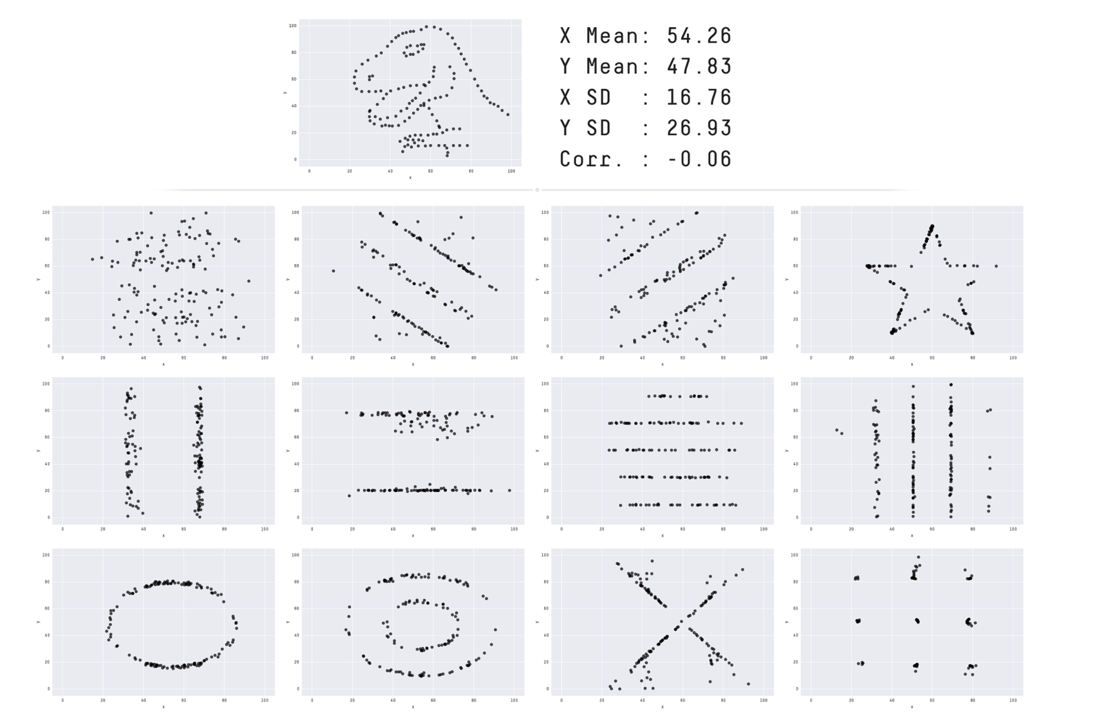
As we can see, even when all the summary statistics across the scatterplots are identical, the visual patterns tell completely different stories. This reinforces a powerful point made by Cairo: “Never trust summary statistics alone; always visualize your data.”
When exploring any dataset, it’s essential to include at least a few visualizations -- The example above shows exactly why. Visuals help us uncover patterns, spot outliers, and reveal relationships that would be nearly impossible to detect by looking at raw numbers alone.
In the following section, we’ll introduce the plotting library seaborn and show how to use it to build powerful visual tools for understanding the CalEnviroScreen data.
Choosing a Subset
For the purpose of visualizations in this notebook, we will only be focusing on eight column attributes from the ces_cc DataFrame. Run the code cell below to save the subset as a new DataFrame
# Run this code cell

ces_subset = ces_cc[['CES 4.0 Score', 'PM2.5', 'Asthma', 'Pollution Burden Score', 'Low Birth Weight', 'Education','Poverty', 'Housing Burden']]
4.1 Histograms
Let’s begin by exploring the distributions of some key columns in ces_subset to better understand the shape and spread of our data. Remember that a distribution describes the range of values a variable can take, and how frequently those values occur. Visualizing distributions helps us identify patterns such as skewness, spread, and the presence of outliers.
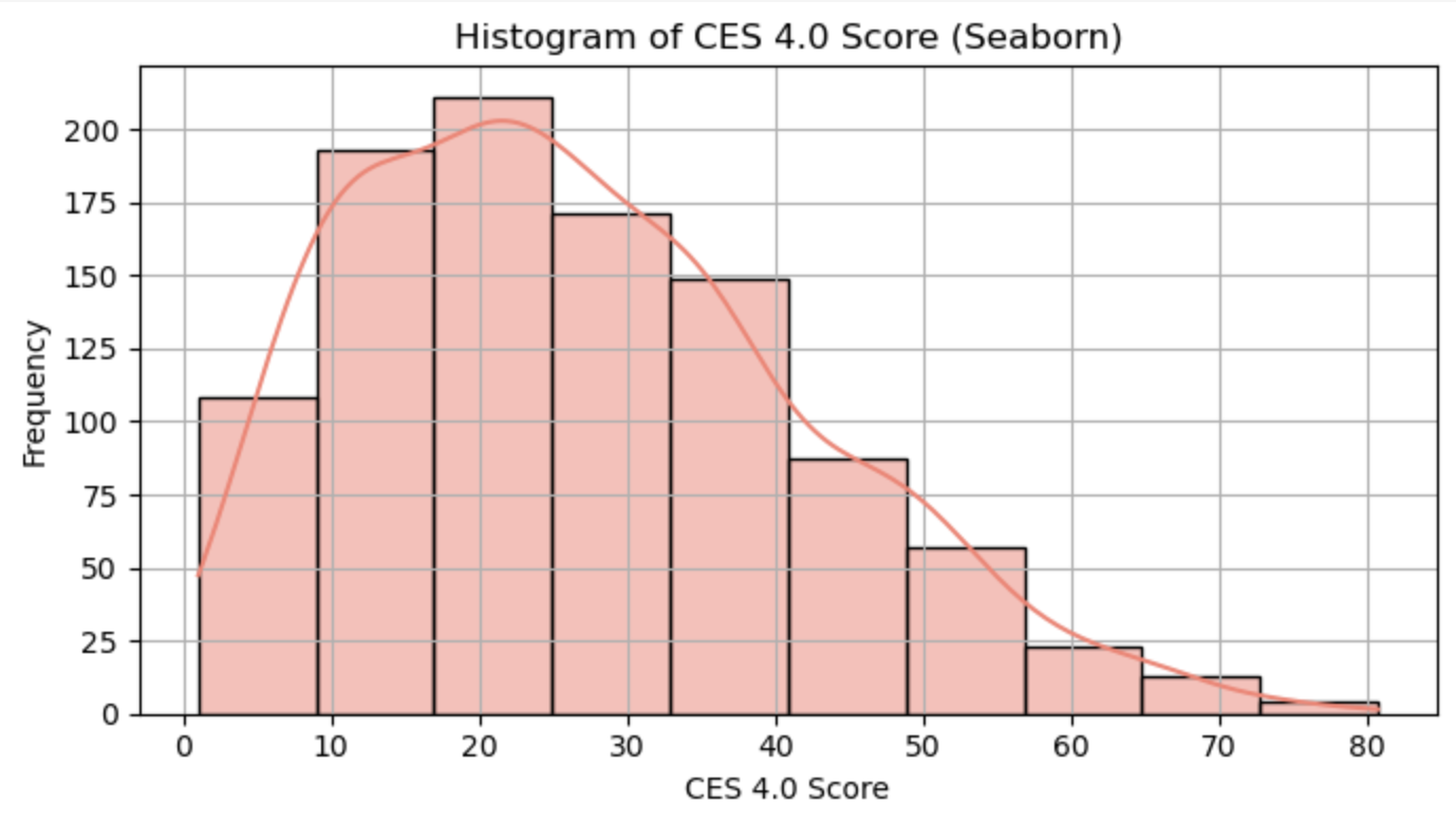
To do this, we’ll use Seaborn’s .histplot() function to create a histogram of the CES 4.0 Score across census tracts. In the example below, we’ve included the argument stat='density' to plot the data in terms of proportion (or relative frequency) rather than raw counts. In a density histogram, the area of the bars — not their height — represents the percentage of data in each interval.
For example, if the area between the 0–10 bins is 0.30, that means 30% of the data falls within that range, and the total area under the curve will always sum to 1 (or 100%).
Run the cell to get familiar with the syntax and output.
sns.histplot(ces_subset, x='CES 4.0 Score', stat='density')
plt.title('The Distribution of CES 4.0 Score Across Census Tracts');
Graphing Tips
A great habit to develop when creating visualizations is to always plot with clarity in mind. Make sure to give your plot a meaningful title that describes what you’re showing. While Seaborn automatically labels the x- and y-axes based on the data you provide, adding a clear title helps ensure your audience understands the purpose of the visualization.
You’re also welcome, and encouraged, to experiment with the color and theme of your Seaborn plot. Seaborn makes it easy to customize visualizations, and exploring these options can help you find a style that best fits your message. For more guidance, check out the full Seaborn documentation.
While customizing visuals can help make your data more engaging, keep in mind that color choices can introduce unintended bias. For example, red is often associated with danger or negativity, while green tends to signal positivity or approval. It’s important to be mindful of these associations, especially when your visualizations are meant to inform or persuade.
These small details go a long way in making your insights more interpretable and effective!
The cell below uses ipywidgets to create interactive buttons. Selecting a button will dynamically display the distribution of values for the corresponding feature in our dataset, allowing you to explore multiple variables in a more engaging way.
Run the cell below. Please do not modify any of the lines—this cell has been pre-written to generate a specific visualization you’ll use to answer the following questions.
from utils import *

display(ui)
Question 4.1.1: Select one of the features using the buttons above to display its histogram. Then, write 1–2 sentences describing the shape of the distribution. What stands out to you? Are there any signs of skewness or clustering?
Type your answer here, replacing this text.
Question 4.1.2: Plot a histogram showing the distribution of Asthma across census tracts using ces_subset. Be sure to include a title for your plot.
# BEGIN SOLUTION NO PROMPT
sns.histplot(ces_subset, x='Asthma', stat='density')
plt.title('The Distribution of Asthma Across Census Tracts');
# END SOLUTION
""" # BEGIN PROMPT
sns.histplot(..., x='...', stat='...')
""" # END PROMPT
plt.title('The Distribution of Asthma Across Census Tracts');
QUESTION 4.1.3: Describe the distribution above in 1-2 sentences.
Type your answer here, replacing this text.
4.2 Multiple Attributes
Supppose we wanted to compare the distributions of multiple attributes side by side? A great tool for this is the violin plot — a type of visualization that combines aspects of a box plot and a histogram. They allow us to display the distributions, spreads, and concentrations of multiple variables, typically grouped by one or more categories, which makes them super useful!
Violin plots are especially useful when comparing how distributions differ across groups, because they show not only summary statistics (like the median and interquartile range), but also the shape of the distribution itself.
To create a violin plot, we’ll use Seaborn’s .violinplot() function. You can read more about its parameters and options in the documentation.
Run the cell below. Please do not modify any of the lines—this cell has been pre-written to generate a specific visualization you’ll use to answer the following questions.
# Just run this code cell
cities = ['Los Angeles', 'San Bernardino', 'East Los Angeles', 'Compton']
ces_cities = ces[['Approximate Location', 'CES 4.0 Score', 'PM2.5', 'Asthma', 'Pollution Burden Score', 'Low Birth Weight', 'Education','Poverty', 'Housing Burden']]
ces_cities = ces_cities[ces_cities['Approximate Location'].isin(cities)]
sns.violinplot(ces_cities, x='Approximate Location', y='CES 4.0 Score');
plt.title('Violin Plots for varying Approximate Locations and CES 4.0 Score');
Question 4.2.1: Write down 2-3 observations based on the violinplot above.
Type your answer here, replacing this text.
4.3 Correlations
For the final part of our visualization section, we’ll explore how visualizations can deepen our understanding of relationships between different features in a dataset — not just their individual distributions.
Pairplots
One useful tool for this is Seaborn’s .pairplot(), which allows us to quickly generate a matrix of pairwise relationships between numerical columns. When you pass in a DataFrame, it creates an grid of plots, where is the number of selected columns. The diagonal shows the distribution of each feature (via histograms or KDEs), while the off-diagonal plots reveal potential correlations or patterns between feature pairs.
This technique is commonly used in the early stages of feature selection for machine learning models. By visualizing how features relate to one another, we can identify redundancies, strong correlations, or variables that may be particularly informative for prediction. Run the cell below to generate a pairplot and begin exploring these relationships in our dataset.
Run the cell below. Please do not modify any of the lines—this cell has been pre-written to generate a specific visualization you’ll use to answer the following questions.
g = sns.pairplot(ces_subset)
g.fig.suptitle("Seaborn Pairplot for Visualizing Relationships in `ces_subset`",
               y=1.02);
Question 4.3.1: From this plot we can see that Poverty and Housing Burden seem to have a positive, linear relationship which is indicated the scatter of points that fall along a line with a positive slope. What other relationships do you see in the pairplot?
Type your answer here, replacing this text.
Scatterplots
Pairplots can be feel a bit overwhelming! While they’re useful for quickly visualizing many scatterplots at once, it’s difficult to focus on the fine-grained details of any single relationship. These kinds of plots are typically used during early exploration — for example, to identify features that might correlate with a target variable when building a machine learning model.
However, they’re not ideal for communicating results to a broader audience or including in a client-facing deliverable, since they pack in a lot of information with much of it may being irrelevant. To better understand how one variable behaves in relation to another, let’s zoom in and examine a single plot in the next question.
Run the cell below. Please do not modify any of the lines—this cell has been pre-written to generate a specific visualization you’ll use to answer the following questions.
sns.scatterplot(data=ces_subset, x='Education', y='Poverty')
plt.title('Scatterplot of Education vs Poverty');
plt.show()
Hmm, this seems a bit counterintuitive — why does it look like higher ‘Education’ is associated with higher poverty rates?
Question 4.3.2: Refer back to the data dictionary and try to understand what the definitions of Education and Poverty. Then, formulate a response as to why this behavior is the way it is
Type your answer below
Education: Type Your Answer HerePoverty: Type Your Answer Here
Type Your Answer Here
Aside: Hexbin Plots
As an interesting alternative, we can visualize the same relationship using a hexbin plot!
Instead of plotting individual points, a hexbin plot groups nearby data into hexagonal bins and uses color to represent the number of observations in each bin. This makes it easier to spot densely populated areas in the plot, especially when dealing with large datasets where points may overlap.
The plot below shows how Education and Poverty relate across census tracts, and where the data is most concentrated:
sns.set_theme(style="ticks")
g = sns.jointplot(
    data=ces_subset,
    x='Education',
    y='Poverty',
    kind='hex',
    color="#4CB391",
)

# Add a title to the overall figure
g.fig.suptitle('Hexbin Plot of Education vs. Poverty', y=1.02);
Heatmap
We can also uncover meaningful insights by examining the correlation between variables in our dataset.
The cell below calculates the correlation coefficients between several key socioeconomic indicators, and visualizes them using a heatmap. A heatmap is a color-coded visualization that shows the strength and direction of the linear relationship between pairs of variables.
This is conceptually similar to a pairplot (which shows scatterplots between all pairs of variables), but instead of displaying the raw data, a correlation heatmap summarizes those relationships using a single number: the correlation coefficient (ranging from -1 to 1). Positive values indicate that as one variable increases, the other tends to increase; negative values suggest the opposite.
Run the cell below to generate the heatmap, and take a moment to interpret the patterns. Please do not modify any of the lines—this cell has been pre-written to generate a specific visualization you’ll use to answer the following questions.
# Create a correlation matrix
corr_matrix = ces_subset.corr()

# Plot the heatmap
plt.figure(figsize=(8, 6))
sns.heatmap(corr_matrix, annot=True, cmap='coolwarm', vmin=-1, vmax=1)
plt.title('Correlation Between Population Characteristics and Pollution Burden')
plt.show()
Question 4.3.3: Which pairs of variables appear to be strongly or weakly correlated with each other? Identify one strong correlation and explain why these two variables might be closely related. Feel free to use the data dictionary to support your reasoning!
Type your answer here, replacing this text.
These were just a few of the many powerful visualization tools that data scientists have in their arsenal. While each plot type serves a different purpose, they all help us tell a story with our data. Unfortunately, we didn’t cover all the plots here, but some you may have seen in CS 8 include line plots for sequential or time-based data, bar charts for categorical comparisons, and boxplots.
No matter the chart type, the underlying goal remains of data visualization remains the same: uncover what the data is trying to tell us. This is why exploratory data analysis (EDA) is such a critical step in the data science lifecycle! Through EDA, we can identify patterns, detect outliers, assess distributions, and reveal feature importance. The decisions we make during this step of the data science lifecycle will inform our model-making processes later down the line.
5. Data-driven Decision Making
Throughout this notebook, we’ve explored how to manipulate and visualize data to uncover meaningful insights about socioeconomic disparities across California. By working with real-world data from CalEnviroScreen, you’ve seen firsthand how data science can be used to analyze patterns of inequality and environmental burden.
Below are a few examples of the kinds of questions data scientists should reflect on during any project. These include considerations around potential biases in the dataset, and how to begin shaping the narrative when presenting findings to others.
Question 5.1: How might geographic bias affect the accuracy or interpretation of CalEnviroScreen scores in different areas of California, such as urban versus rural regions? Write 1–2 sentences explaining how differences in data availability or population density might influence the results.
Hint: Would you expect larger populated areas to have more complete/reliable data? Why?
Type your answer here, replacing this text.
Question 5.2: Imagine you’re presenting your findings to the City of Torrance Environmental Quality and Energy Conservation Commission, the board responsible for sustainability and pollution oversight in Torrance.
In 3–4 sentences, draft a letter to the City of Torrance Environmental Quality and Energy Conservation Commission. Use evidence from your analysis to highlight environmental concerns in the area surrounding El Camino College. Consider how these issues may be impacting the health and well-being of students and the surrounding community, and make a data-driven case for why action is needed. You might reference the indicators we covered above
Type your answer here, replacing this text.

This project introduced you to the principles of data analysis using a modified version of real-life environmental justice data. By cleaning and exploring our CalEnviroScreen dataset, merging it with the California community college dataset, and learning how to create meaningful data visualizations, we’ve built a strong foundation in data wrangling and exploratory data analysis.
In the next phase of the Data Science Lifecycle, we’ll be transitioning from exploration, to model development. This includes identifying relevant features, applying techniques like feature engineering, and using our cleaned data to begin the development of predictive models. We’ll then assess model quality via some evaluation metrics, ensuring our findings are both accurate and interpretable.
This is just the tip of the data-science iceberg, we look forward to seeing you in Project 2!!!
Submission
Make sure you have run all cells in your notebook in order before running the cell below, so that all images/graphs appear in the output. The cell below will generate a zip file for you to submit. Please save before exporting!
These are some submission instructions.
# Save your notebook first, then run this cell to export your submission.
grader.export(run_tests=True)