import geopandas as gpd

# Provide the path to your GIS file (e.g., .shp file)
file_path = 'calenviroscreen40shpf2021shp/CES4 Final Shapefile.shp'

# Load the shapefile
gdf = gpd.read_file(file_path)

# Display the first few rows of the GeoDataFrame
gdf.head()
Loading...
# map the data
gdf.plot()
# View the first few rows to get an overview
gdf.head()
Loading...
# Check the columns in the dataset
gdf.columns
Index(['Tract', 'ZIP', 'County', 'ApproxLoc', 'TotPop19', 'CIscore',
'CIscoreP', 'Ozone', 'OzoneP', 'PM2_5', 'PM2_5_P', 'DieselPM',
'DieselPM_P', 'Pesticide', 'PesticideP', 'Tox_Rel', 'Tox_Rel_P',
'Traffic', 'TrafficP', 'DrinkWat', 'DrinkWatP', 'Lead', 'Lead_P',
'Cleanup', 'CleanupP', 'GWThreat', 'GWThreatP', 'HazWaste', 'HazWasteP',
'ImpWatBod', 'ImpWatBodP', 'SolWaste', 'SolWasteP', 'PollBurd',
'PolBurdSc', 'PolBurdP', 'Asthma', 'AsthmaP', 'LowBirtWt', 'LowBirWP',
'Cardiovas', 'CardiovasP', 'Educatn', 'EducatP', 'Ling_Isol',
'Ling_IsolP', 'Poverty', 'PovertyP', 'Unempl', 'UnemplP', 'HousBurd',
'HousBurdP', 'PopChar', 'PopCharSc', 'PopCharP', 'Child_10',
'Pop_10_64', 'Elderly65', 'Hispanic', 'White', 'AfricanAm', 'NativeAm',
'OtherMult', 'Shape_Leng', 'Shape_Area', 'AAPI', 'geometry'],
dtype='object')# Check for missing values
gdf.isnull().sum()Tract 0
ZIP 0
County 0
ApproxLoc 0
TotPop19 0
..
OtherMult 0
Shape_Leng 0
Shape_Area 0
AAPI 0
geometry 0
Length: 67, dtype: int64# Summary statistics for numerical columns
gdf.describe()Loading...
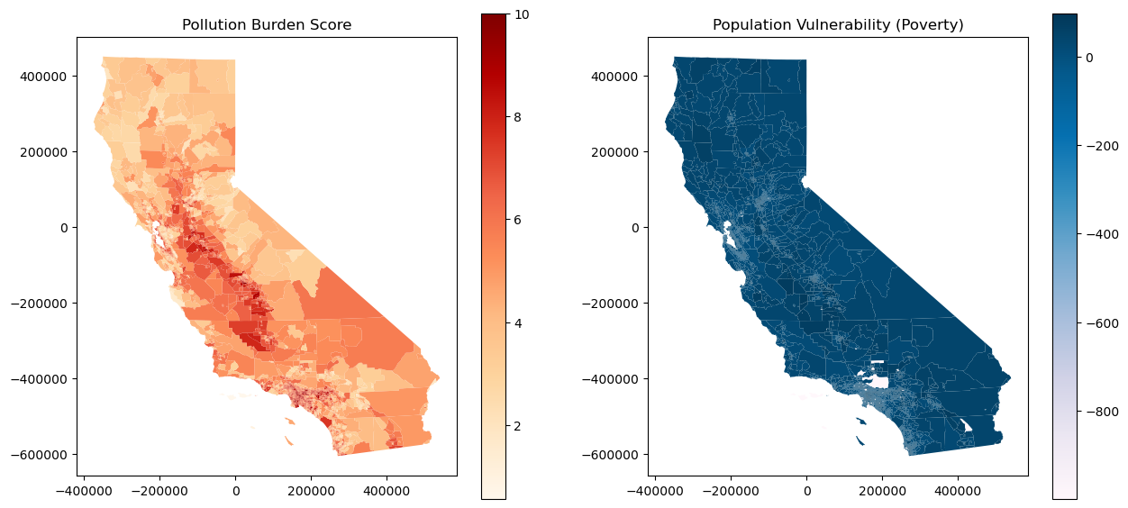
import matplotlib.pyplot as plt

# Create a figure with subplots to compare pollution burden and population vulnerability
fig, ax = plt.subplots(1, 2, figsize=(15, 7))

# Plot Pollution Burden on the left
gdf.plot(column='PolBurdSc', ax=ax[0], legend=True, cmap='OrRd')
ax[0].set_title('Pollution Burden Score')

# Plot Population Vulnerability on the right (example with 'Poverty' column)
gdf.plot(column='Poverty', ax=ax[1], legend=True, cmap='PuBu')
ax[1].set_title('Population Vulnerability (Poverty)')

plt.show()
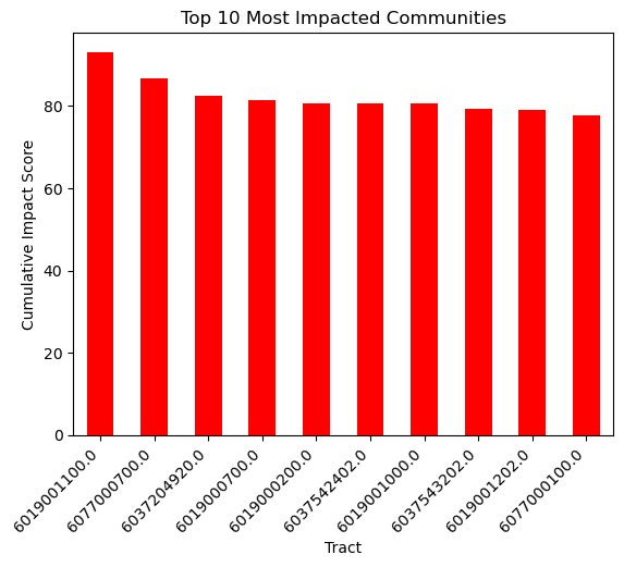
# Sort the data by Cumulative Impact Score and take the top 10
top_10 = gdf.nlargest(10, 'CIscore')

# Create a bar plot
top_10.plot(kind='bar', x='Tract', y='CIscore', legend=False, color='red')

plt.title('Top 10 Most Impacted Communities')
plt.ylabel('Cumulative Impact Score')
plt.xticks(rotation=45, ha='right')
plt.show()
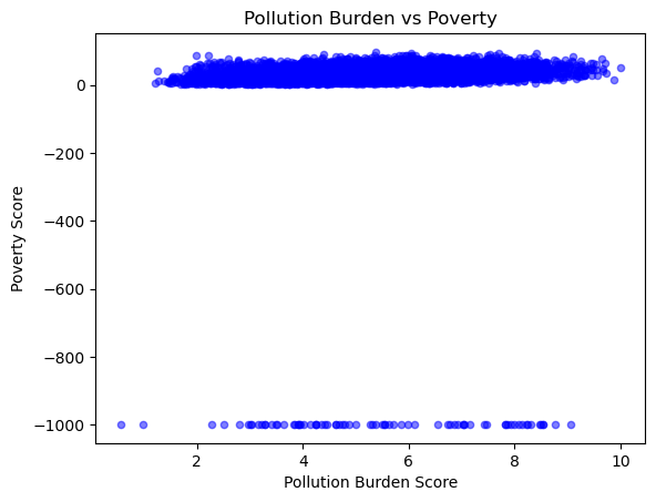
# Scatter plot comparing Pollution Burden Score to Poverty Score
gdf.plot.scatter(x='PolBurdSc', y='Poverty', alpha=0.5, color='blue')

plt.title('Pollution Burden vs Poverty')
plt.xlabel('Pollution Burden Score')
plt.ylabel('Poverty Score')
plt.show()
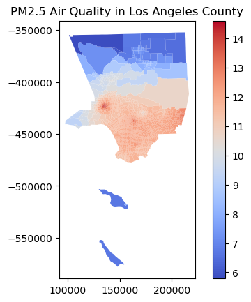
# Filter for a specific region, e.g., Los Angeles County
la_county = gdf[gdf['County'] == 'Los Angeles']

# Plot the Air Quality Score for LA County
la_county.plot(column='PM2_5', legend=True, cmap='coolwarm')

plt.title('PM2.5 Air Quality in Los Angeles County')
plt.show()
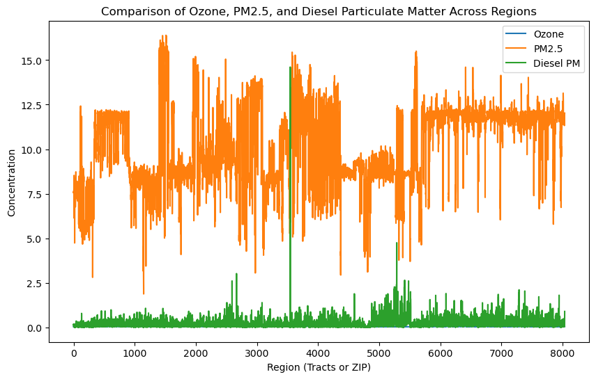
# Select a few columns to compare
hazards = gdf[['Ozone', 'PM2_5', 'DieselPM']]

# Plot a multi-line chart
hazards.plot(figsize=(10, 6))

plt.title('Comparison of Ozone, PM2.5, and Diesel Particulate Matter Across Regions')
plt.xlabel('Region (Tracts or ZIP)')
plt.ylabel('Concentration')
plt.legend(['Ozone', 'PM2.5', 'Diesel PM'])
plt.show()
import seaborn as sns

# Select columns for correlation matrix
corr_columns = ['Poverty', 'Unempl', 'HousBurd', 'PolBurdSc', 'Asthma', 'Cardiovas']

# Create a correlation matrix
corr_matrix = gdf[corr_columns].corr()

# Plot the heatmap
plt.figure(figsize=(8, 6))
sns.heatmap(corr_matrix, annot=True, cmap='coolwarm', vmin=-1, vmax=1)
plt.title('Correlation Between Population Characteristics and Pollution Burden')
plt.show()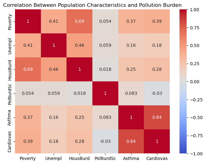
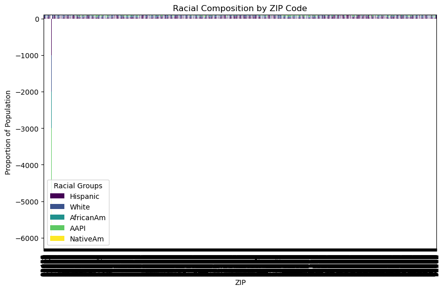
# Set up a stacked bar plot for racial composition by ZIP code
gdf[['ZIP', 'Hispanic', 'White', 'AfricanAm', 'AAPI', 'NativeAm']].set_index('ZIP').plot(
    kind='bar', stacked=True, figsize=(10, 6), colormap='viridis')

plt.title('Racial Composition by ZIP Code')
plt.ylabel('Proportion of Population')
plt.legend(title='Racial Groups')
plt.xticks(rotation=90)
plt.show()
/Users/ericvandusen/Library/jupyterlab-desktop/jlab_server/lib/python3.8/site-packages/IPython/core/pylabtools.py:152: UserWarning: Creating legend with loc="best" can be slow with large amounts of data.
fig.canvas.print_figure(bytes_io, **kw)
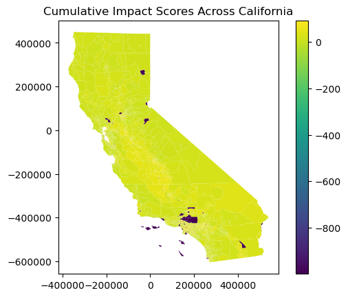
# Plot a statewide map of cumulative impact scores
gdf.plot(column='CIscore', legend=True)

plt.title('Cumulative Impact Scores Across California')
plt.show()