Using Real Zillow Research Data
Estimated Time: ~60 minutes
Contents:
Introduction: Why Transition from Excel to Pandas?
Setting Up: Loading Real Zillow Data
Understanding the Wide Format
Reshaping with pd.melt() — Excel’s “Unpivot”
Basic Data Operations
Reading Data
Viewing and Inspecting Data
Excel Functions Translated to Pandas
VLOOKUP/XLOOKUP → merge() and map()
FILTER → Boolean Indexing
SUMIF/COUNTIF → Conditional Aggregations
IF Statements → np.where() and apply()
Advanced Operations
PIVOT TABLES → pivot_table() and groupby()
JOINs → merge() with home_values + rent_values datasets
Data Visualization
Bar Charts
Line Charts
Interactive Widgets and Practice
Exercises
Conclusion
# Import necessary libraries
import pandas as pd
import numpy as np
import matplotlib.pyplot as plt
import seaborn as sns
from IPython.display import display, HTML, Markdown
from interact import (
    explore_data_widget,
    filter_markets_widget,
    pivot_table_widget,
    metro_trends_widget,
)
import warnings
warnings.filterwarnings('ignore')

# Set plot style
plt.style.use('seaborn-v0_8-darkgrid')
sns.set_palette("husl")

print("✅ All libraries imported successfully!")
print("\n📌 Note: This notebook uses interactive widgets (ipywidgets)")
print("   You'll see dropdowns and sliders throughout — just run each cell and use the controls!")
✅ All libraries imported successfully!
📌 Note: This notebook uses interactive widgets (ipywidgets)
You'll see dropdowns and sliders throughout — just run each cell and use the controls!
Introduction: Why Transition from Excel to Pandas?
Excel is a powerful tool for data analysis, but it has limitations:
Scale: Excel struggles with datasets larger than ~1 million rows
Reproducibility: Manual operations are hard to document and reproduce
Automation: Repetitive tasks require VBA or manual effort
Version Control: Tracking changes is difficult
Pandas, a Python library, addresses these issues:
Handles millions of rows efficiently
All operations are code-based and reproducible
Easy to automate workflows
Integrates with version control systems (Git)
Free and open-source
In this notebook, you’ll learn how to translate your Excel skills into Pandas using real housing market data from Zillow Research!
Key Concept: DataFrames vs Spreadsheets
In Excel, you work with worksheets containing cells organized in rows and columns.
In Pandas, you work with DataFrames — similar structure but with powerful programmatic capabilities:
| Excel Concept | Pandas Equivalent |
|---|---|
| Workbook | Multiple DataFrames |
| Worksheet | DataFrame |
| Column | Series (df['column_name']) |
| Row | Row (df.loc[row_index]) |
| Cell | Single value (df.loc[row, col]) |
Setting Up: Loading Real Zillow Data
We’ll work with two real datasets published by Zillow Research:
home_values (Zillow Home Value Index) — the typical home value by metro area, monthly, going back to 2000
home_values (Zillow Observed Rent Index) — the typical observed rent by metro area, monthly
These are the same datasets analysts at real estate firms and banks use for housing market research.
Load Zillow Home Value Index (home_values)
Excel: File → Open → Browse → select the CSV
Pandas: use
pd.read_csv()with a URL or file pathAlso load the rent_values rent dataset for the same metros
# URLs from https://www.zillow.com/research/data/
zhvi_URL = (
    "https://files.zillowstatic.com/research/public_csvs/zhvi/"
    "Metro_zhvi_uc_sfrcondo_tier_0.33_0.67_sm_sa_month.csv"
)
zori_URL = (
    "https://files.zillowstatic.com/research/public_csvs/zori/"
    "Metro_zori_uc_sfrcondomfr_sm_month.csv"
)

print("⏳ Downloading home value data (ZHVI) from Zillow Research...")
home_values_wide = pd.read_csv(zhvi_URL)
print(f"✅ Home values loaded: {home_values_wide.shape[0]} metro areas × {home_values_wide.shape[1]} columns")

print("\n⏳ Downloading rent data (ZORI) from Zillow Research...")
rent_values_wide = pd.read_csv(zori_URL)
print(f"✅ Rent values loaded: {rent_values_wide.shape[0]} metro areas × {rent_values_wide.shape[1]} columns")
⏳ Downloading home value data (ZHVI) from Zillow Research...
✅ Home values loaded: 895 metro areas × 318 columns
⏳ Downloading rent data (ZORI) from Zillow Research...
✅ Rent values loaded: 721 metro areas × 138 columns
# Let's look at what the raw home value data looks like
print("Raw home value data (first 5 rows, first 10 columns):")
display(home_values_wide.iloc[:5, :10])

print("\n📌 Notice the structure:")
print("  • Each ROW = one metro area (e.g., 'Los Angeles, CA')")
print("  • Each COLUMN after StateName = a monthly date (e.g., '2000-01-31')")
print("  • Each VALUE = the typical home value in $ for that metro + month")
print(f"\n  Total date columns: {home_values_wide.shape[1] - 5}")
Raw home value data (first 5 rows, first 10 columns):
📌 Notice the structure:
  • Each ROW = one metro area (e.g., 'Los Angeles, CA')
  • Each COLUMN after StateName = a monthly date (e.g., '2000-01-31')
  • Each VALUE = the typical home value in $ for that metro + month

  Total date columns: 313
💡 Understanding the ‘Wide’ Format
The Zillow CSV is in wide format — each date is its own column. This is common in Excel:
| RegionName | 2000-01-31 | 2000-02-29 | 2000-03-31 | ... |
|---|---|---|---|---|
| Los Angeles, CA | 210,000 | 212,000 | 214,000 | ... |
| New York, NY | 350,000 | 351,000 | 353,000 | ... |
For most pandas analysis, we need long format — each row is one observation (metro + date + value):
| RegionName | Date | HomeValue |
|---|---|---|
| Los Angeles, CA | 2000-01-31 | 210,000 |
| Los Angeles, CA | 2000-02-29 | 212,000 |
| New York, NY | 2000-01-31 | 350,000 |
Excel Equivalent: Data → Get & Transform → Unpivot Columns
Pandas Equivalent: pd.melt()
Excel ‘Unpivot’ → pd.melt()
In Excel: Data → Get & Transform → Unpivot Columns
In pandas: use
pd.meltto reshape wide date columns into rowsKeep metadata columns as identifiers and unpivot the date columns
# Identify the metadata columns (non-date columns)
meta_cols = ['RegionID', 'SizeRank', 'RegionName', 'RegionType', 'StateName']

# Identify the date columns (everything else)
date_cols = [c for c in home_values_wide.columns if c not in meta_cols]

print(f"Metadata columns: {meta_cols}")
print(f"Number of date columns: {len(date_cols)}")
print(f"Date range: {date_cols[0]} → {date_cols[-1]}")

home_values = pd.melt(
    home_values_wide,
    id_vars=meta_cols,        # columns to KEEP as-is
    value_vars=date_cols,     # columns to UNPIVOT into rows
    var_name='Date',          # name for the new 'column header' column
    value_name='HomeValue'    # name for the new 'value' column
)

# Convert Date string to an actual datetime object
home_values['Date'] = pd.to_datetime(home_values['Date'])

# Drop rows where HomeValue is missing (some early months have no data)
home_values = home_values.dropna(subset=['HomeValue'])

print(f"\n✅ Reshaped to long format: {home_values.shape[0]:,} rows × {home_values.shape[1]} columns")
print("\nFirst 5 rows of long-format data:")
display(home_values.head())

# Backwards-compatible alias used elsewhere in the notebook
home_values = home_values
Metadata columns: ['RegionID', 'SizeRank', 'RegionName', 'RegionType', 'StateName']
Number of date columns: 313
Date range: 2000-01-31 → 2026-01-31
✅ Reshaped to long format: 230,869 rows × 7 columns
First 5 rows of long-format data:
# Do the same for rent_values (rent data)
rent_meta_cols = ['RegionID', 'SizeRank', 'RegionName', 'RegionType', 'StateName']
rent_date_cols = [c for c in rent_values_wide.columns if c not in rent_meta_cols]

rent_values = pd.melt(
    rent_values_wide,
    id_vars=rent_meta_cols,
    value_vars=rent_date_cols,
    var_name='Date',
    value_name='Rent'
)
rent_values['Date'] = pd.to_datetime(rent_values['Date'])
rent_values = rent_values.dropna(subset=['Rent'])

print(f"✅ rent_values long format (rent values): {rent_values.shape[0]:,} rows × {rent_values.shape[1]} columns")
display(rent_values.head())
✅ rent_values long format (rent values): 48,768 rows × 7 columns
Column definitions (long-format data)
home_values (Zillow Home Value Index, one row per metro per month):
RegionID — Zillow’s unique numeric ID for the region.
SizeRank — Rank by market size (0 = largest, e.g. United States or New York; higher = smaller market).
RegionName — Name of the metro or area (e.g. “New York, NY”, “Los Angeles, CA”).
RegionType — Geography type:
country(e.g. United States), ormsa= Metropolitan Statistical Area (a core city plus surrounding counties the U.S. government groups as one economic region; “metro” in the data means MSA).StateName — State code (e.g. NY, CA); missing for U.S. or non-state regions.
Date — Month of the observation (month-end date).
HomeValue — Typical home value in dollars (ZHVI, smoothed, seasonally adjusted, mid-tier).
rent_values (Zillow Observed Rent Index, one row per metro per month):
RegionID — Zillow’s unique numeric ID for the region.
SizeRank — Rank by market size (0 = largest).
RegionName — Name of the metro or area.
RegionType — Geography type:
countryormsa(Metropolitan Statistical Area; see above).StateName — State code; missing for U.S. or non-state regions.
Date — Month of the observation.
Rent — Typical observed monthly rent in dollars (ZORI, smoothed).
Basic Data Operations
Reading and Inspecting Data
In Excel, you open a file by clicking it. In Pandas, you use read_csv().
Excel: File → Open → Browse → Select file
Pandas: df = pd.read_csv('filename.csv') or df = pd.read_csv('https://...')
Essential Inspection Methods
| Excel Action | Pandas Method | Purpose |
|---|---|---|
| Scroll to see data | df.head() or df.tail() | View first/last rows |
| Ctrl+Down to see size | df.shape | Get (rows, columns) |
| Right-click column header | df.info() | See column types and non-null counts |
| Select column → look at status bar | df.describe() | Get summary statistics |
# Interactive widget to explore different inspection methods
explore_data_widget(home_values)Excel Functions Translated to Pandas
1. VLOOKUP / XLOOKUP → merge() and map()
VLOOKUP looks up a value in one table and pulls a column from another table.
Excel Formula: =VLOOKUP(RegionName, RentTable, RentColumn, FALSE)
Pandas Equivalent: df.merge() — joins two DataFrames like a SQL JOIN
We’ll use this to attach rent data (rent_values) to home value data (home_values) for the same metro areas.
Using map() as a simpler VLOOKUP
Goal: build a dictionary from
RegionNameto latestHomeValueUse
.map()to attach that lookup value to each rowEquivalent to an Excel VLOOKUP returning a single column
# Find the most recent date in the dataset
latest_date = home_values['Date'].max()
print(f"Most recent month in dataset: {latest_date.strftime('%B %Y')}")

# Create a dictionary mapping RegionName → latest HomeValue
# This is like building a lookup table in Excel
latest_values = (
    home_values[home_values['Date'] == latest_date]
    .set_index('RegionName')['HomeValue']
    .to_dict()
)

print(f"\nSample entries from our lookup dictionary:")
sample_keys = list(latest_values.keys())[:5]
for k in sample_keys:
    print(f"  {k}: ${latest_values[k]:,.0f}")

# Now apply it to the full dataset using map()
# Excel equivalent: =VLOOKUP(A2, LookupTable, 2, FALSE)
latest_home_values = home_values[home_values['Date'] == latest_date].copy()
latest_home_values['NationalRank'] = latest_home_values['SizeRank']

# Backwards-compatible name used elsewhere in the notebook
home_values_latest = latest_home_values

print("\nUsing map() to rank markets by size:")
display(latest_home_values[['RegionName', 'StateName', 'HomeValue', 'NationalRank']]
        .sort_values('NationalRank')
        .head(10))
Most recent month in dataset: January 2026
Sample entries from our lookup dictionary:
United States: $357,445
New York, NY: $703,126
Los Angeles, CA: $943,674
Chicago, IL: $333,939
Dallas, TX: $357,649
Using map() to rank markets by size:
Using merge() as a full VLOOKUP
Goal: combine latest home values and rents for each metro
Start from home_values (home values) and join rent_values (rents) on
RegionNameKeep all metros from home_values and fill missing rents with
NaN
latest_rent_values = rent_values[rent_values['Date'] == rent_values['Date'].max()][['RegionName', 'Rent']]
latest_home_snapshot = home_values[home_values['Date'] == latest_date][['RegionName', 'StateName', 'HomeValue', 'SizeRank']]

# This is like doing =VLOOKUP(RegionName, rent_valuesTable, RentColumn, FALSE)
# but getting ALL columns from the rent table at once
housing = latest_home_snapshot.merge(
    latest_rent_values,
    on='RegionName',
    how='left'  # Keep all metros from the home value table, fill NaN if no rent data
)

print(f"Merged dataset shape: {housing.shape}")
print("\nHousing data with home values AND rents:")
display(housing.dropna().sort_values('SizeRank').head(10))
Merged dataset shape: (895, 5)
Housing data with home values AND rents:
💡 map() vs merge() — When to Use Which?
| Situation | Use |
|---|---|
| You need ONE value from a lookup table | map() |
| You need MULTIPLE columns from another table | merge() |
| You want SQL-style join behavior (inner, outer, left) | merge() |
| Fastest option for a simple single-column lookup | map() |
2. FILTER → Boolean Indexing
FILTER in Excel (or AutoFilter) selects rows that meet a condition.
Excel: Data → Filter → select criteria
Pandas: df[condition] — called Boolean Indexing
Simple filter: California metros only
Excel: AutoFilter on
StateName = 'CA'Pandas: subset rows where
StateNameequals'CA'Then sort metros by
HomeValuedescending
ca_metros = latest_home_values[latest_home_values['StateName'] == 'CA']

print(f"California metros: {len(ca_metros)}")
display(ca_metros[['RegionName', 'HomeValue']].sort_values('HomeValue', ascending=False))
California metros: 34
Multi-condition filters
AND condition: CA metros with
HomeValue > 800000OR condition: metros in TX or FL
Use
&and|with boolean expressions in pandas
expensive_ca = latest_home_values[
    (latest_home_values['StateName'] == 'CA') &
    (latest_home_values['HomeValue'] > 800_000)
]
print("CA metros with home values > $800K:")
display(expensive_ca[['RegionName', 'HomeValue']].sort_values('HomeValue', ascending=False))

tx_fl = latest_home_values[
    (latest_home_values['StateName'] == 'TX') |
    (latest_home_values['StateName'] == 'FL')
]
print(f"\nTX or FL metros: {len(tx_fl)}")
display(tx_fl[['RegionName', 'StateName', 'HomeValue']].sort_values('HomeValue', ascending=False).head(10))
CA metros with home values > $800K:
TX or FL metros: 96
Filtering for multiple values with isin()
Mimic Excel’s AutoFilter with multiple checked states
Define a list of target states like CA, NY, TX, FL, WA
Use
df['StateName'].isin(target_states)to select matching rows
# Interactive Filter Widget
filter_markets_widget(latest_home_values)3. SUMIF / COUNTIF → Conditional Aggregations
SUMIF and COUNTIF calculate totals or counts based on conditions.
Excel Formula: =AVERAGEIF(StateName, "CA", HomeValue)
Pandas Equivalent: Filter then aggregate, or use groupby()
SUMIF / COUNTIF equivalents
AVERAGEIF: compute average
HomeValuefor California metrosCOUNTIF: count how many metros there are in each state
Use filtering plus
.mean()andvalue_counts()in pandas
ca_avg = latest_home_values[latest_home_values['StateName'] == 'CA']['HomeValue'].mean()
print(f"Average home value in CA: ${ca_avg:,.0f}")

print("\nNumber of metro areas per state (like COUNTIF):")
metros_per_state = latest_home_values['StateName'].value_counts()
display(metros_per_state.head(10))
Average home value in CA: $598,870
Number of metro areas per state (like COUNTIF):
StateName
TX    67
OH    44
NC    37
GA    37
IN    36
CA    34
PA    34
MI    31
FL    29
NY    26
Name: count, dtype: int64
groupby() as multi-state SUMIF/AVERAGEIF
Aggregate
HomeValuebyStateNamein one stepCompute median, mean, count, and max per state
Excel equivalent would require separate SUMIF/AVERAGEIF formulas for each state
state_summary = latest_home_values.groupby('StateName')['HomeValue'].agg(
    Median_Home_Value='median',
    Mean_Home_Value='mean',
    Num_Metros='count',
    Max_Home_Value='max'
).round(0).sort_values('Median_Home_Value', ascending=False)

print("Home value statistics by state (top 10 most expensive):")
display(state_summary.head(10))
Home value statistics by state (top 10 most expensive):
Time-based aggregation: national home value by year
Add a
Yearcolumn derived from theDateUse
groupby('Year')and an aggregation likemedianExcel equivalent:
AVERAGEIFSwith a year criterion
home_values['Year'] = home_values['Date'].dt.year

annual_avg = home_values.groupby('Year')['HomeValue'].median().round(0)

print("Median US home value by year:")
display(annual_avg.tail(10))

print(f"\n📈 Home values from {annual_avg.index[0]} to {annual_avg.index[-1]}:")
print(f"   ${annual_avg.iloc[0]:,.0f} → ${annual_avg.iloc[-1]:,.0f}")
print(f"   Total increase: {((annual_avg.iloc[-1] / annual_avg.iloc[0]) - 1) * 100:.0f}%")
Median US home value by year:
Year
2017    142800.0
2018    150168.0
2019    157832.0
2020    167874.0
2021    189856.0
2022    213013.0
2023    221058.0
2024    230200.0
2025    237802.0
2026    242259.0
Name: HomeValue, dtype: float64
📈 Home values from 2000 to 2026:
   $97,990 → $242,259
   Total increase: 147%
4. IF Statements → np.where() and apply()
Excel’s IF function creates conditional logic in new columns.
Excel Formula: =IF(HomeValue > 500000, "Expensive", "Affordable")
Pandas Equivalent: np.where() or apply()
Simple IF classification
Excel:
=IF(HomeValue > 500000, "Expensive", "Affordable")Pandas: use
np.whereto assign “Expensive” or “Affordable” labelsCreates an
Affordabilitycolumn based onHomeValue
latest_home_values_copy = home_values_latest.copy()
latest_home_values_copy['Affordability'] = np.where(
    latest_home_values_copy['HomeValue'] > 500_000,
    'Expensive',
    'Affordable'
)

print("Markets classified by affordability:")
display(latest_home_values_copy[['RegionName', 'StateName', 'HomeValue', 'Affordability']]
        .sort_values('HomeValue', ascending=False)
        .head(10))

print("\nCounts:")
print(latest_home_values_copy['Affordability'].value_counts())
Markets classified by affordability:
Counts:
Affordability
Affordable    825
Expensive      70
Name: count, dtype: int64
Nested IF logic for market tiers
Excel example:
IF(HomeValue>1000000, "Ultra-Luxury", IF(HomeValue>600000, "Luxury", ...))In pandas, write a helper function and apply it to
HomeValueProduces categorical labels like Ultra-Luxury, Luxury, Mid-Range, Affordable
def classify_market(home_value):
    if home_value > 1_000_000:
        return 'Ultra-Luxury'
    elif home_value > 600_000:
        return 'Luxury'
    elif home_value > 400_000:
        return 'Mid-Range'
    else:
        return 'Affordable'

latest_home_values_copy['MarketTier'] = latest_home_values_copy['HomeValue'].apply(classify_market)

print("Market tier distribution:")
print(latest_home_values_copy['MarketTier'].value_counts())

print("\nSample of each tier:")
display(latest_home_values_copy.groupby('MarketTier')
        .apply(lambda x: x.nsmallest(2, 'SizeRank'))
        [['RegionName', 'StateName', 'HomeValue', 'MarketTier']]
        .reset_index(drop=True))
Market tier distribution:
MarketTier
Affordable 756
Mid-Range 100
Luxury 30
Ultra-Luxury 9
Name: count, dtype: int64
Sample of each tier:
np.select() for multi-level conditions
Use multiple boolean conditions and matching labels
Cleaner than deeply nested
np.wherecallsSimilar to Excel’s
IFS()with several thresholds
conditions = [
    latest_home_values_copy['HomeValue'] > 1_000_000,
    latest_home_values_copy['HomeValue'] > 600_000,
    latest_home_values_copy['HomeValue'] > 400_000,
]
choices = ['Ultra-Luxury', 'Luxury', 'Mid-Range']

latest_home_values_copy['MarketTier_v2'] = np.select(conditions, choices, default='Affordable')

print("Using np.select() — same result, cleaner code for many conditions:")
print(latest_home_values_copy['MarketTier_v2'].value_counts())
Using np.select() — same result, cleaner code for many conditions:
MarketTier_v2
Affordable 756
Mid-Range 100
Luxury 30
Ultra-Luxury 9
Name: count, dtype: int64
Advanced Operations
PIVOT TABLES → pivot_table() and groupby()
Pivot tables are one of Excel’s most powerful features for summarizing data.
Excel: Insert → PivotTable → Drag fields
Pandas: df.pivot_table() or df.groupby()
Pivot: median home value by market tier
Copy the latest snapshot with
MarketTierclassificationsBuild a pivot of median
HomeValuebyMarketTierCompare results to an equivalent
groupbyaggregation
home_values_pivot = latest_home_values_copy.copy()

pivot1 = home_values_pivot.pivot_table(
    values='HomeValue',
    index='MarketTier',
    aggfunc='median'
).round(0)

print("Median home value by market tier:")
display(pivot1)

# Same result using groupby
print("\nSame result using groupby:")
display(home_values_pivot.groupby('MarketTier')['HomeValue'].median().round(0))
Median home value by market tier:
Same result using groupby:
MarketTier
Affordable       220670.0
Luxury           747826.0
Mid-Range        459441.0
Ultra-Luxury    1114767.0
Name: HomeValue, dtype: float64
Advanced pivot: State × Market Tier
Build a 2D pivot counting metros by state and market tier
Restrict to states with at least 5 metros for readability
Similar to an Excel pivot table with rows, columns, and counts
states_with_many = home_values_pivot['StateName'].value_counts()
states_to_show = states_with_many[states_with_many >= 5].index

pivot2 = home_values_pivot[home_values_pivot['StateName'].isin(states_to_show)].pivot_table(
    values='HomeValue',
    index='StateName',
    columns='MarketTier',
    aggfunc='count',   # count of metros in each cell
    fill_value=0,
    margins=True       # Add totals (like "Grand Total" row/column in Excel pivot)
)

print("Count of metros per state × market tier (states with 5+ metros):")
display(pivot2)
Count of metros per state × market tier (states with 5+ metros):
# Multiple aggregations: stats on home values by tier
pivot3 = home_values_pivot.pivot_table(
    values='HomeValue',
    index='MarketTier',
    aggfunc=['min', 'median', 'max', 'count']
).round(0)

print("Home value statistics by market tier:")
display(pivot3)
Home value statistics by market tier:
# Interactive Pivot Table Builder
pivot_table_widget(home_values_pivot)Calculating Change Over Time — pct_change() vs Excel Formulas
Excel Formula: =(B2-A2)/A2 for percent change between two cells
Pandas: .pct_change() — applies the formula across an entire column at once
Year-over-year (YoY) home value change
Calculate YoY change for each metro using current vs prior year values
In Excel this would require many repeated formulas
In pandas we can compute it for all metros in a few steps
# Get the last two years of data
one_year_ago = latest_date - pd.DateOffset(years=1)

latest_vals = home_values[home_values['Date'] == latest_date][['RegionName', 'StateName', 'HomeValue']].rename(
    columns={'HomeValue': 'Current'}
)
prior_vals = home_values[home_values['Date'] == home_values[home_values['Date'] <= one_year_ago]['Date'].max()][
    ['RegionName', 'HomeValue']
].rename(columns={'HomeValue': 'OneYearAgo'})

yoy = latest_vals.merge(prior_vals, on='RegionName', how='inner')

# Excel: =(Current - OneYearAgo) / OneYearAgo
yoy['YoY_Change_Pct'] = ((yoy['Current'] - yoy['OneYearAgo']) / yoy['OneYearAgo'] * 100).round(2)

print("Top 10 fastest-appreciating markets (YoY):")
display(yoy.nlargest(10, 'YoY_Change_Pct')[['RegionName', 'StateName', 'Current', 'YoY_Change_Pct']])

print("\nTop 10 declining markets (YoY):")
display(yoy.nsmallest(10, 'YoY_Change_Pct')[['RegionName', 'StateName', 'Current', 'YoY_Change_Pct']])
Top 10 fastest-appreciating markets (YoY):
Top 10 declining markets (YoY):
JOINs → merge() with home_values + rent_values
In Excel, you might use VLOOKUP or Power Query to combine tables. In Pandas, we use merge() which offers SQL-style joins.
Types of Joins:
Left Join: Keep all rows from the left table, match where possible
Inner Join: Keep only rows that match in both tables
Outer Join: Keep all rows from both tables, fill NaN where no match
Prepare snapshots for joins
Filter home_values to the latest date and keep key columns
Filter rent_values to the latest date and keep rent information
These snapshots will be joined on
RegionName
home_values_snap = home_values[home_values['Date'] == latest_date][['RegionName', 'StateName', 'HomeValue']]
rent_values_snap = rent_values[rent_values['Date'] == rent_values['Date'].max()][['RegionName', 'Rent']]

print(f"home_values metros: {len(home_values_snap)}")
print(f"rent_values metros: {len(rent_values_snap)}")
region_col = 'RegionName'
print(f"Metros in both: {len(set(home_values_snap[region_col]) & set(rent_values_snap[region_col]))}")
home_values metros: 895
rent_values metros: 721
Metros in both: 705
Left join: keep all home_values metros
Attach rent data from rent_values where available
Metros without rent data will have
NaNin theRentcolumn
left_join = home_values_snap.merge(rent_values_snap, on='RegionName', how='left')
print(f"LEFT JOIN rows: {len(left_join)} (same as home_values: {len(home_values_snap)})")
print(f"Metros with rent data: {left_join['Rent'].notna().sum()}")
display(left_join.sort_values('HomeValue', ascending=False).head(8))
LEFT JOIN rows: 895 (same as home_values: 895)
Metros with rent data: 705
Inner join: metros in both datasets
Join home_values and rent_values only where the metro appears in both
Equivalent to Excel or SQL inner join on
RegionName
inner_join = home_values_snap.merge(rent_values_snap, on='RegionName', how='inner')
print(f"INNER JOIN rows: {len(inner_join)} (only metros in both datasets)")
display(inner_join.sort_values('HomeValue', ascending=False).head(8))
INNER JOIN rows: 705 (only metros in both datasets)
After merging, calculate derived metrics
Price-to-Rent Ratio: how many years of rent equals the home value
Excel:
=HomeValue / (Rent * 12)Pandas: compute annual rent and price-to-rent for each metro
housing_combined = inner_join.copy()
housing_combined['Annual_Rent'] = housing_combined['Rent'] * 12
housing_combined['Price_to_Rent'] = (housing_combined['HomeValue'] / housing_combined['Annual_Rent']).round(1)

# Buy vs Rent signal
# Rule of thumb: P/R < 15 → better to buy; P/R > 20 → better to rent
housing_combined['Buy_vs_Rent'] = np.select(
    [
        housing_combined['Price_to_Rent'] < 15,
        housing_combined['Price_to_Rent'] > 20
    ],
    ['Lean Buy', 'Lean Rent'],
    default='Neutral'
)

print("Buy vs Rent Analysis by Metro:")
display(housing_combined[['RegionName', 'StateName', 'HomeValue', 'Rent', 'Price_to_Rent', 'Buy_vs_Rent']]
        .sort_values('Price_to_Rent', ascending=False)
        .head(12))

print("\nBuy vs Rent signal distribution:")
print(housing_combined['Buy_vs_Rent'].value_counts())
Buy vs Rent Analysis by Metro:
Buy vs Rent signal distribution:
Buy_vs_Rent
Neutral      286
Lean Buy     247
Lean Rent    172
Name: count, dtype: int64
Data Visualization
Excel charts are great for quick visualizations. Pandas + Matplotlib/Seaborn offer much more customization and are fully reproducible!
Excel: Select data → Insert → Chart
Pandas: df.plot() or matplotlib/seaborn functions
Bar Charts
# Bar chart: Median home value by state (top 15 states)
top_states = (home_values_latest
              .groupby('StateName')['HomeValue']
              .median()
              .nlargest(15)
              .sort_values(ascending=True))

plt.figure(figsize=(10, 7))
top_states.plot(kind='barh', color='steelblue')
plt.title('Top 15 States by Median Home Value', fontsize=16, fontweight='bold')
plt.xlabel('Median Home Value ($)', fontsize=12)
plt.ylabel('State', fontsize=12)

# Add value labels — like Excel's data labels
for i, v in enumerate(top_states):
    plt.text(v + 5000, i, f'${v/1e6:.2f}M' if v > 1e6 else f'${v/1e3:.0f}K',
             va='center', fontsize=9)

plt.grid(axis='x', alpha=0.3)
plt.tight_layout()
plt.show()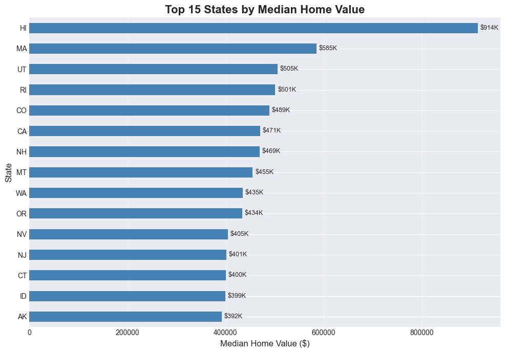
# Grouped bar chart: Market tier breakdown for select states
select_states = ['CA', 'TX', 'FL', 'NY', 'WA']
tier_by_state = (
    latest_home_values_copy[latest_home_values_copy['StateName'].isin(select_states)]
    .groupby(['StateName', 'MarketTier'])
    .size()
    .unstack(fill_value=0)
)

tier_order = ['Affordable', 'Mid-Range', 'Luxury', 'Ultra-Luxury']
tier_by_state = tier_by_state.reindex(columns=[c for c in tier_order if c in tier_by_state.columns])

plt.figure(figsize=(12, 6))
tier_by_state.plot(kind='bar', width=0.8)
plt.title('Market Tier Breakdown by State', fontsize=16, fontweight='bold')
plt.xlabel('State', fontsize=12)
plt.ylabel('Number of Metro Areas', fontsize=12)
plt.legend(title='Market Tier', fontsize=10)
plt.xticks(rotation=0)
plt.grid(axis='y', alpha=0.3)
plt.tight_layout()
plt.show()
<Figure size 1200x600 with 0 Axes>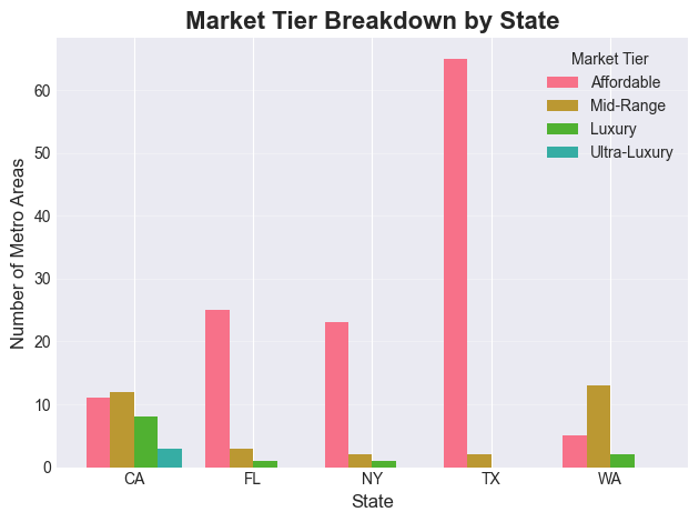
Line Charts
# Time series: National median home value over time
national_trend = home_values.groupby('Date')['HomeValue'].median()

plt.figure(figsize=(14, 6))
national_trend.plot(kind='line', linewidth=2.5, color='steelblue')

# Annotate key events (just like Excel text boxes)
plt.axvline(pd.Timestamp('2008-09-01'), color='red', linestyle='--', alpha=0.7, label='2008 Financial Crisis')
plt.axvline(pd.Timestamp('2020-03-01'), color='orange', linestyle='--', alpha=0.7, label='COVID-19 Pandemic')

plt.title('U.S. National Median Home Value Over Time', fontsize=16, fontweight='bold')
plt.xlabel('Date', fontsize=12)
plt.ylabel('Median Home Value ($)', fontsize=12)
plt.legend(fontsize=11)
plt.grid(True, alpha=0.3)
plt.tight_layout()
plt.show()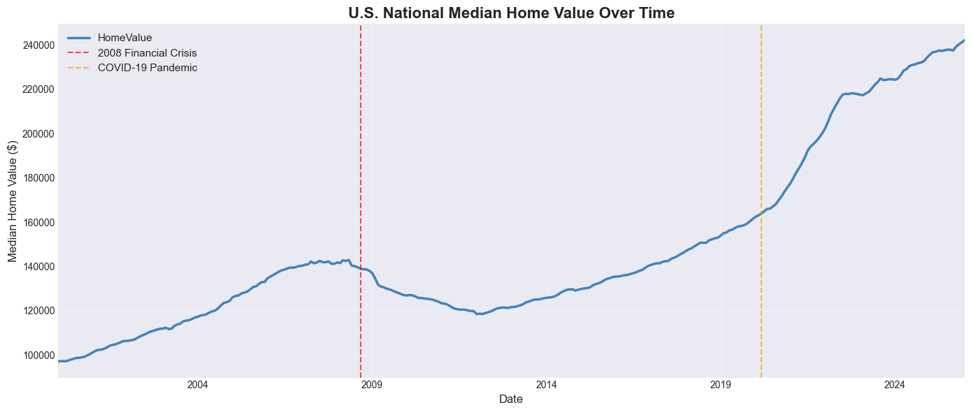
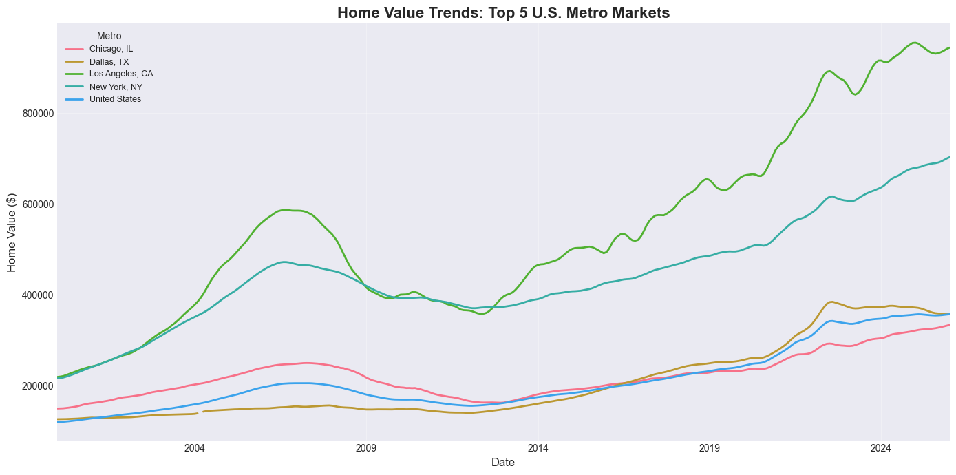
# Multiple lines: Home value trends for top 5 metros
top5_metros = home_values_latest.nsmallest(5, 'SizeRank')['RegionName'].tolist()
print(f"Top 5 metros by market size: {top5_metros}")

metro_trends = home_values[home_values['RegionName'].isin(top5_metros)].copy()
metro_pivot = metro_trends.pivot(index='Date', columns='RegionName', values='HomeValue')

plt.figure(figsize=(14, 7))
metro_pivot.plot(ax=plt.gca(), linewidth=2)
plt.title('Home Value Trends: Top 5 U.S. Metro Markets', fontsize=16, fontweight='bold')
plt.xlabel('Date', fontsize=12)
plt.ylabel('Home Value ($)', fontsize=12)
plt.legend(title='Metro', fontsize=9, loc='upper left')
plt.grid(True, alpha=0.3)
plt.tight_layout()
plt.show()
Top 5 metros by market size: ['United States', 'New York, NY', 'Los Angeles, CA', 'Chicago, IL', 'Dallas, TX']
# Interactive: Pick any metros to compare
metro_trends_widget(home_values)Practice Exercises
Now it’s your turn! Use the Zillow data to answer each question.
Exercise 1: State-Level Filtering and Aggregation
Find all metro areas in Texas (TX) where the current median home value is above the national median. Display the results sorted by home value (descending).
Hint: Calculate the national median first, then use boolean indexing with two conditions.
Guidelines
Compute the national median using
home_values_latest['HomeValue'].median().Filter
home_values_latestto rows whereStateName == 'TX'andHomeValueis greater than the national median.Sort the filtered result by
HomeValuein descending order.Display a table with
RegionNameandHomeValue.
# Your code here

# Step 1: Compute the national median home value
# national_median = home_values_latest[ ... ]
# print(f"National median home value: ${national_median:,.0f}")

# Step 2: Filter to Texas metros with HomeValue above the national median
# tx_above_national = home_values_latest[ ... ]

# Step 3: Sort by HomeValue (descending) and display RegionName and HomeValue
# tx_above_national = tx_above_national.sort_values( ... )
# display(tx_above_national[[ ... ]])
# Solution: Exercise 1
national_median = home_values_latest['HomeValue'].median()
print(f'National median home value: ${national_median:,.0f}')
tx_above_national = home_values_latest[
(home_values_latest['StateName'] == 'TX') &
(home_values_latest['HomeValue'] > national_median)
].sort_values('HomeValue', ascending=False)
print(f"\nTexas metros above national median: {len(tx_above_national)}")
display(tx_above_national[['RegionName', 'HomeValue']])National median home value: $242,259
Texas metros above national median: 21
Exercise 2: Pivot Table — Average Home Value by Market Tier and State
Create a pivot table showing the average home value for each Market Tier broken down by the top 8 states (by metro count). Add row/column margins.
Hint: Use latest_home_values_copy which already has the MarketTier column.
Guidelines
Count metros per state and select the top 8 states.
Filter
latest_home_values_copyto rows whereStateNameis in that top-8 list.Use
pivot_tablewith:values='HomeValue'index='StateName'columns='MarketTier'aggfunc='mean'margins=Truefor totals.
Optionally round the result for nicer display.
# Your code here

# Step 1: Identify the top 8 states by metro count
# top8_states = ...

# Step 2: Filter latest_home_values_copy to only those top-8 states
# filtered = ...

# Step 3: Build a pivot table of average HomeValue by StateName and MarketTier
# pivot_ex2 = filtered.pivot_table(
#     values=...,  # column to aggregate
#     index=...,   # rows
#     columns=..., # columns
#     aggfunc=..., # aggregation function
#     fill_value=0,
#     margins=True,
# )

# Step 4: Optionally round and display the result
# pivot_ex2 = pivot_ex2.round(0)
# display(pivot_ex2)
# Solution: Exercise 2
top8_states = latest_home_values_copy['StateName'].value_counts().head(8).index
pivot_ex2 = latest_home_values_copy[latest_home_values_copy['StateName'].isin(top8_states)].pivot_table(
values='HomeValue',
index='StateName',
columns='MarketTier',
aggfunc='mean',
fill_value=0,
margins=True
).round(0)
print('Average home value by state and market tier:')
display(pivot_ex2)Average home value by state and market tier:
Exercise 3: Year-Over-Year Growth Chart
Plot the annual median U.S. home value as a line chart. Then add a second line showing the year-over-year percent change.
Hint: Use home_values.groupby('Year') and .pct_change().
Guidelines
Group
home_valuesbyYearand compute the medianHomeValuefor each year.Use
.pct_change()on that annual series to compute YoY percent change.Create a figure with two subplots side by side using
plt.subplots(1, 2, ...).Plot the annual median values on the first subplot.
Plot the YoY percent change on the second subplot (add a horizontal 0% line for reference).
Add titles, axis labels, and grid lines for readability.
# Your code here

# Step 1: Aggregate to annual median home values
# annual_median = ...

# Step 2: Compute year-over-year percent change
# annual_growth = ...

# Step 3: Create a figure with two subplots side by side
# fig, (ax1, ax2) = plt.subplots(...)

# Step 4: Plot annual_median on the first axis
# annual_median.plot(ax=ax1, ...)
# ax1.set_title(...)
# ax1.set_ylabel(...)

# Step 5: Plot annual_growth on the second axis
# annual_growth.plot(ax=ax2, ...)
# ax2.axhline(y=0, ...)
# ax2.set_title(...)
# ax2.set_ylabel(...)

# Step 6: Format the layout
# plt.tight_layout()
# plt.show()
# Solution: Exercise 3
annual_median = home_values.groupby('Year')['HomeValue'].median()
annual_growth = annual_median.pct_change() * 100
fig, (ax1, ax2) = plt.subplots(1, 2, figsize=(14, 5))
annual_median.plot(ax=ax1, marker='o', linewidth=2, color='steelblue')
ax1.set_title('Annual Median Home Value (U.S., All Metros)', fontweight='bold')
ax1.set_ylabel('Home Value ($)')
ax1.grid(True, alpha=0.3)
annual_growth.plot(ax=ax2, marker='o', linewidth=2, color='green', label='YoY growth')
ax2.axhline(y=0, color='red', linestyle='--', alpha=0.5, label='Zero growth')
ax2.set_title('Year-Over-Year Growth Rate (U.S., All Metros)', fontweight='bold')
ax2.set_ylabel('Growth Rate (%)')
ax2.legend()
ax2.grid(True, alpha=0.3)
plt.tight_layout()
plt.show()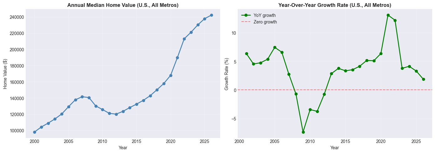
Exercise 4: Buy vs. Rent Analysis
Using housing_combined, classify metros into ‘Lean Buy’, ‘Neutral’, or ‘Lean Rent’ based on their Price-to-Rent ratio (thresholds: < 15 = Buy, > 20 = Rent). Then create a bar chart showing the count of metros in each category, broken down by state (top 6 states by metro count).
Hint: housing_combined already has Buy_vs_Rent and Price_to_Rent columns.
Guidelines
Identify the top 6 states by metro count in
housing_combined.Filter to those states only.
Group by
StateNameandBuy_vs_Rent, and use.size()to count metros in each combination.Use
.unstack()so the buy/rent categories become columns.Plot the resulting table as a grouped bar chart with a clear title, axis labels, and legend.
# Your code here

# Step 1: Find the top 6 states by metro count
# top6 = ...

# Step 2: Filter housing_combined to those states
# ex4_data = ...

# Step 3: Group by StateName and Buy_vs_Rent and count metros
# tier_counts = (
#     ex4_data.groupby([ ... ])
#     .size()
#     .unstack(fill_value=0)
# )

# Step 4: Plot the grouped bar chart
# plt.figure(...)
# tier_counts.plot(kind='bar', ...)
# plt.title(...)
# plt.xlabel(...)
# plt.ylabel(...)
# plt.xticks(...)
# plt.legend(...)
# plt.grid(...)
# plt.tight_layout()
# plt.show()
# Solution: Exercise 4
top6 = housing_combined['StateName'].value_counts().head(6).index
ex4_data = housing_combined[housing_combined['StateName'].isin(top6)]
tier_counts = (
ex4_data.groupby(['StateName', 'Buy_vs_Rent'])
.size()
.unstack(fill_value=0)
)
plt.figure(figsize=(12, 6))
tier_counts.plot(kind='bar', width=0.8)
plt.title('Buy vs. Rent Signal by State', fontsize=14, fontweight='bold')
plt.xlabel('State')
plt.ylabel('Number of Metros')
plt.xticks(rotation=0)
plt.legend(title='Signal')
plt.grid(axis='y', alpha=0.3)
plt.tight_layout()
plt.show()<Figure size 1200x600 with 0 Axes>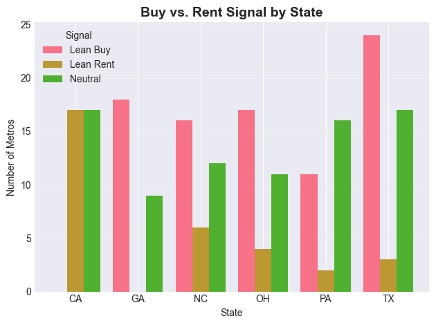
Conclusion
Congratulations! You’ve translated your Excel skills into Pandas using real Zillow housing market data. Here’s a summary of what you covered:
Key Takeaways:
Wide → Long format:
pd.melt()is Excel’s “Unpivot” — essential for time series data like home_valuesVLOOKUP → merge(): Join datasets with flexible left/inner/outer options
FILTER → Boolean Indexing: Filter rows programmatically with
&,|,.isin()SUMIF/COUNTIF → groupby(): Aggregate across all groups in one line
IF Statements → np.where() / apply(): Create conditional columns at scale
Pivot Tables → pivot_table(): Summarize data with row/column/value dimensions
Charts → matplotlib/seaborn: Reproducible, annotatable, publication-quality plots
Why Pandas > Excel for This Kind of Data:
✅ Scalability: The home_values dataset has 300+ metros × 280+ months = 80,000+ data points — trivial for pandas, painful in Excel
✅ Reproducibility: Every transformation is documented in code
✅ Automation: Re-run this notebook every month as new data is released with zero manual effort
✅ Live Data: Load directly from a URL — no manual downloading required
Next Steps:
Explore the full Zillow Research data catalog for other datasets
Learn time series forecasting with
statsmodelsorprophetBuild a regression model to predict home values using
scikit-learnAutomate a monthly housing report using Jupyter and pandas
Resources:
Quick Reference Cheat Sheet
| Excel Function | Pandas Equivalent | Zillow Example |
|---|---|---|
| File → Open CSV | pd.read_csv(url) | pd.read_csv(home_values_URL) |
| Data → Unpivot | pd.melt() | Wide home_values → long format |
| VLOOKUP | df.merge() | Join home_values + rent_values by RegionName |
| VLOOKUP (1 col) | series.map(dict) | Map RegionName → home value |
| AutoFilter | Boolean indexing | df[df['StateName'] == 'CA'] |
| FILTER (multi-value) | .isin() | df[df['State'].isin(['CA','NY'])] |
| SUMIF | groupby().sum() | Total value by state |
| AVERAGEIF | groupby().mean() | Avg home value by tier |
| COUNTIF | value_counts() | Count of metros per state |
| IF | np.where() | Classify Affordable vs Expensive |
| Nested IFS | np.select() | Multi-tier market classification |
| IF (complex) | .apply(func) | Custom categorization logic |
| =(B-A)/A | .pct_change() | Year-over-year home value growth |
| PivotTable | pivot_table() | Value by state × tier |
| Insert → Chart | df.plot() | Time series, bar charts |
| AVERAGE | .mean() | Mean home value nationally |
| MAX/MIN | .max() / .min() | Most/least expensive metro |
Congratulations on completing From Excel to Pandas: Housing Market Edition! 🎉
You’re now equipped to work with large, real-world datasets — the same data used by housing economists, mortgage analysts, and real estate investors. Keep practicing!
Happy coding! 🐍📊