You will be learning about historical events that have impacted incarceration rates across different racial groups.
Estimated Time: ~30 minutes
By: Ariana Ghimire
1. Introduction to Data
a. Overview of Data Table
b. Explanation of Table Columns
c. Question 1
d. First Look
2. War on Drugs
a. Introduction to the War on Drugs
b. Crack vs. Cocaine
c. Growth Rate of Drug Use
d. Question 2
e. 1990s Drug Drop
f. Percent of Arrests by Population
g. Questions 3 and 4
3. Redlining
a. County-Level Data
b. Historical Context of Redlining in Counties
c. Question 5
4. Sources
Introduction
Import Libraries
To start off with we need to load in some libraries, things like Numpy that we learned. Run the cell below to do so
from datascience import * # Loads functions from the datascience library into our current environment
import numpy as np # Loads numerical functions
import math, random # Loads math and random functions
import pandas as pd
import matplotlib.pyplot as plt
import seaborn as sns
from IPython.display import display, Latex, Markdown
%matplotlib inline
import plotly.express as px
import ipywidgets as widgets
from IPython.display import display
from IPython.display import Video
from ipywidgets import interact
import warnings
warnings.filterwarnings('ignore')
import helper as hp
Helper Video
Use the following link for a follow-along video to help guide you through the notebook:
from IPython.display import YouTubeVideo

YouTubeVideo("X2NvxzQ2CvI", width=560, height=315)Data
The Department of Justice (DOJ) Criminal Justice Statistics Center (CJSC) collects information on arrests and citations
(from now on referred to as “arrest(s)”) as reported by law enforcement agencies (LEAs) throughout the state.
The Monthly Arrest and Citation Register (MACR) data is submitted monthly by LEAs and includes summary arrest counts
submitted to the Federal Bureau of Investigation’s (FBI) Uniform Crime Reporting Program (UCR).
Arrest data provides information on felony and misdemeanor-level arrests for adults and juveniles,
as well as status offenses (e.g., truancy, incorrigibility, running away, and curfew violations) for juveniles.
This data includes aggregated arrest counts by reporting county, age, gender, and race/ethnic group of the arrestee.
The Arrest Disposition data also includes information about the outcome of law enforcement contact.
Run the cell below to load the dataset, view the first few rows, and examine the column names.
arrest = hp.arrest
arrestRun the next cell below to see our columns
print(arrest.columns)Index(['YEAR', 'GENDER', 'RACE', 'AGE_GROUP', 'COUNTY', 'VIOLENT', 'PROPERTY',
'F_DRUGOFF', 'F_SEXOFF', 'F_ALLOTHER', 'F_TOTAL', 'M_TOTAL', 'S_TOTAL',
'Sum Total'],
dtype='object')
Review of Column Labels and Their Descriptions
Year – The year the data was collected, ranging from 1980 to 2023.
Gender – Includes two categories: male and female.
Race – Categorized as White, Black, Hispanic, and Other.
Age Group – Grouped into the following brackets:
Under 18
18–19
20–29
30–39
40–69
70+
County – The California county where the data was reported.
Violent – Number of arrests for crimes classified as violent felonies.
Property – Number of arrests for crimes classified as property felonies.
F_Drugoff – Number of arrests for drug-related felonies.
F_Sexoff – Number of arrests for sex-related felonies.
F_ALLOTHER – Arrests for other felonies not specifically categorized.
F_Totalsum – Total number of felony arrests.
M_Totalsum – Total number of misdemeanor arrests.
S_Total – Total number of juvenile status offenses (e.g., truancy, curfew violations).
Sum Total – Total number of all arrests (felonies, misdemeanors, and status offenses).
Question One
In 2–3 sentences, summarize what this dataset represents using the information above, the column labels, and the sample rows from the data table.
Explain what each row represents, and highlight any personal interests or questions you have about the data.
Answer where your professor has instructed you to.
First Look at Data
In the cell below, you’ll find a widget that displays the number of drug arrests by year.
This widget allows you to interact with the data and select the range of years you’d like to explore.
In the following cell, adjust the slider to examine trends in all felony arrests over time.
display(widgets.interactive(lambda years : hp.plot_arrest(arrest, years), years= hp.year_slider))War on Drugs
Introduction
The War on Drugs disproportionately impacted people of color, particularly Black Americans, despite their relatively small share of the overall U.S. population.
While drug use rates are similar across racial groups, harsh policies—such as mandatory minimum sentences and crack cocaine laws—targeted urban communities where Black and Latino populations were concentrated.
As a result, Black individuals faced drug-related incarceration at significantly higher rates than white individuals.
Despite making up only about 13% of the U.S. population, Black people have historically accounted for a disproportionate percentage of drug arrests and incarcerations.
This racial disparity wasn’t just a coincidence—it was fueled by systemic biases in policing, sentencing, and media portrayals that criminalized Black communities at much higher rates than their white counterparts.
The widget below allows you to explore drug arrest trends.
Adjust the slider to see how the War on Drugs influenced overall drug arrests, especially in relation to key legislation.
display(widgets.interactive(lambda years : hp.plot_drug_arrest(arrest, years), years= hp.year_slider))Race Impacts
Crack vs. Powder Cocaine
The War on Drugs, launched in the 1970s and intensified in the 1980s, led to a surge in drug arrests by 1990 due to harsh federal policies like the Anti-Drug Abuse Acts of 1986 and 1988.
These laws imposed mandatory minimum sentences and created a 100:1 sentencing disparity between crack and powder cocaine, disproportionately affecting Black communities.
The Bush administration expanded “tough on crime” policing through programs like Operation Pipeline, which increased drug-related stops and arrests.
Law enforcement shifted its focus to street-level drug offenses—targeting users and low-level dealers rather than major traffickers.
The rise of three-strikes laws and harsher sentencing further drove up incarceration rates. Meanwhile, media-fueled fears of a “crack epidemic” reinforced racialized policing and political rhetoric, justifying aggressive drug enforcement.
As a result, 1990 saw a spike in drug possession arrests, particularly among minorities, contributing to the long-term trend of mass incarceration in the U.S.
In the next cell, use the dropdown to select the race you’d like to display, and try to observe the differences.
You can also adjust the year range—we recommend setting it from 1980 to 1990.
display(widgets.interactive(lambda years, race : hp.drug_plot_race(arrest, years, race), years= hp.year_slider, race= hp.race_dropdown))It’s challenging to compare different racial groups using separate graphs, but as data scientists, this is an important skill to develop.
To make comparisons easier, we use overlapping graphs.
Use the widget below to select the races you want to graph together (be sure to view all of them together by the end).
You can also adjust the year range—we recommend setting it from 1980 to 1990.
⚠️ Warning: The graph will only update if you have selected at least one race and shifted the year slider.
Each time you make a new selection, remember to adjust the year range to display the updated plot.
display(widgets.VBox(hp.checkboxes), widgets.interactive(lambda years: hp.plot_races(arrest, years), years= hp.year_slider))Rate of Growth
Visualizations are helpful, but it’s also important to look at the numbers.
Let’s take a statistical look at how much arrests increased for each race from the 1980s to 1989.
Use the dropdown below to display the percent growth rates for each group.
display(widgets.interactive(lambda race : hp.drug_percentage_increase(arrest, race), race= hp.race_dropdown))Question Two
How did the War on Drugs impact incarceration numbers?
How did it affect different racial groups?
Black people made up around 7%, white people made up 60%, and Hispanic people made up 25% of California’s population in the 1980s and 1990s — how does this influence your understanding of the data?
Racial Demographics in California (1980s):
White (Non-Hispanic): Approximately 60%
Hispanic or Latino: Around 25%
Black or African American: About 7%
Asian: Roughly 4–5%
Answer where your professor has instructed you to.
1990s Drug Arrest Drop
In the early 1990s, law enforcement in California and across the U.S. shifted its focus from low-level drug offenses to violent crime and gang-related activity.
This change was largely driven by growing concerns over public safety and rising crime rates, leading to policies that prioritized harsher sentencing for repeat offenders.
The 1994 Crime Bill played a significant role in this shift by increasing funding for law enforcement and expanding the prison system.
Additionally, California’s Three Strikes Law, enacted in 1994, imposed life sentences on individuals convicted of three serious crimes. This further redirected law enforcement efforts toward violent and high-profile offenses.
As a result, while drug-related arrests declined, overall incarceration rates remained high due to the crackdown on repeat offenders.
Use the widget below to explore how total felony arrests have changed over the years compared to drug-related felony arrests, especially during the mid-1990s.
See if you can identify the trend: a decline in drug-related arrests, while overall incarceration rates remained high.
display(widgets.interactive(lambda arrest_type, years : hp.plot_type_arrest(arrest,arrest_type, years), arrest_type= hp.arrest_dropdown, years=hp.year_slider))Now, to explore the relationship between drug arrests and violent crime arrests,
observe the violent arrests graph below.
display(widgets.interactive(lambda years : hp.plot_violence(arrest, years, overlay= True), years=hp.year_slider))Arrest Rates Compared to Population Distribution
As mentioned earlier, we don’t get the full picture unless we consider the population distribution of each racial group.
In this next section, we’ll work with a dataset that shows arrest rates for different racial groups compared to their share of the total population in each year.
Run the next cell to display the data.
extended_arrest= hp.type_arrest("Sum Total")
extended_arrestRun the next cell and use the dropdown menu to view the percent of arrests by race for different years.
display(widgets.interactive(lambda year : hp.bar_arrest(extended_arrest, year), year=hp.year_dropdown))It’s hard to see changes over time in the distribution above,
so run the next cell to view arrest data across multiple years for each race.
Use the slider to adjust the year range.
To zoom in on the bars for each race, hover over the graph, then click and drag.
To zoom out, just double-click.
display(widgets.interactive(lambda year : hp.bar_years(extended_arrest, year), year=hp.year_selector))Question Three
Interact with the data by hovering over the bars to see specific information for each year and race.
Identify the year when the percent of arrests was highest and lowest for each racial group.
If comparing the bars is difficult, use the zoom-in function described above to make it easier.
Then, reflect on the following:
How does the arrest rate by race compare to that group’s share of the total population?
Are certain groups overrepresented or underrepresented in the arrest data?
Answer where your professor has instructed you to.
Lastly, we can compare the distributions of percent arrests by race using a box plot.
Run the next cell to display it.
hp.box_arrest(extended_arrest)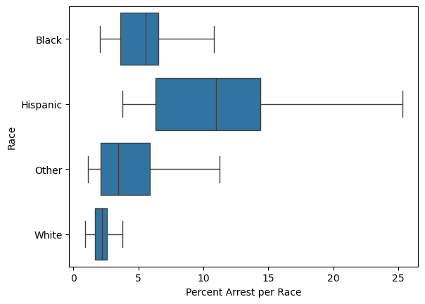
Question Four
Using data science, there are many ways to analyze data and identify patterns, as we did in this section.
With the four methods of displaying data above (table, single bar chart, grouped bar chart, and box plot), consider the following questions and answer below:
Which display of data was your favorite and why? In what ways was it the most helpful, and where did it fall short?
How did looking at the percent per race compare to just viewing the raw numbers?
Which visualization made it easiest to compare trends over multiple years? Why?
How did the box plot help in understanding the spread and variation in the data compared to the bar charts?
If you were to analyze a different dataset, which of these methods would you choose, and would you use any additional visualizations?
Answer where your professor has instructed you to.
Redlining and Gentrification
Redlining and gentrification are interconnected processes that have shaped urban landscapes and deeply impacted marginalized communities.
Redlining was a discriminatory practice in which certain neighborhoods—often predominantly inhabited by people of color—were marked as high-risk areas for investment.
This led to long-lasting disparities in housing access, public services, and economic opportunities. These neighborhoods were denied loans, infrastructure, and investment, which fueled cycles of poverty and disinvestment.
As gentrification occurs, these once-redlined areas are often targeted for redevelopment. While this can lead to economic revitalization, it frequently results in the displacement of lower-income, long-standing residents—exacerbating existing social and racial inequalities.
Gentrification is particularly harmful to marginalized communities because it leads to:
The loss of affordable housing
Displacement of residents
Erasure of cultural identity
Increased policing and surveillance
Disruption of social networks and support systems
Rising economic pressure on low-income families
These changes often result in increased criminalization of the very communities that are being displaced, deepening structural inequality.
Use the widget below to display felony arrests across different counties.
Explore the data and make some initial observations.
display(widgets.interactive(lambda x : hp.map_f_arrest(arrest, x), x=hp.county_dropdown))---------------------------------------------------------------------------
NameError Traceback (most recent call last)
Cell In[1], line 1
----> 1 display(widgets.interactive(lambda x : hp.map_f_arrest(arrest, x), x=hp.county_dropdown))
NameError: name 'widgets' is not definedData science is a powerful tool, but it doesn’t always capture the full picture.
In the case of gentrification and its effects on crime, for example, we often rely on county-level data to track trends.
However, these broader datasets can miss the nuances essential for a complete understanding.
County-level data may show a decrease in crime rates, but that doesn’t account for the displacement of marginalized communities, increased surveillance, or social upheaval happening at the neighborhood level.
To draw more accurate and truthful conclusions, data scientists must recognize the limitations of their data and acknowledge the context these numbers exist within.
Without considering the underlying social dynamics—such as increased policing, changing community structures, and economic pressures—analysis can present an incomplete or misleading picture.
Understanding these limitations and broader social context is essential for producing more accurate insights and making informed, responsible decisions.
📝 To-Do:
Choose one or two counties from the list below and read about how gentrification has impacted them.
Then, use the widget above to explore the data and make observations.
Reflection Prompt:
How does the historical information provided align with the trends shown in the data? In what ways?
County Information
San Francisco County
Gentrification Start: Early 1990s
Neighborhoods like the Mission District, Tenderloin, and Bayview-Hunters Point have seen significant gentrification driven by tech industry growth.
Rising housing costs and an influx of wealthier residents have displaced long-time working-class communities.Los Angeles County
Gentrification Start: Early 2000s (accelerated in 2010s)
Areas like Downtown LA, Echo Park, Silver Lake, and Highland Park have been transformed by rising rents, real estate development, and an influx of young professionals, displacing lower-income, immigrant, and minority communities.Oakland (Alameda County)
Gentrification Start: Mid-2000s
Neighborhoods such as West Oakland, Fruitvale, and Uptown have experienced gentrification as higher-income residents moved in due to San Francisco’s rising costs, leading to displacement.Santa Clara County (San Jose)
Gentrification Start: Early 2000s
The tech boom in Silicon Valley increased housing demand, particularly in downtown San Jose and surrounding areas, displacing lower-income, predominantly Latino communities.San Diego County
Gentrification Start: Mid-2000s
Neighborhoods like North Park, Logan Heights, and Barrio Logan have gentrified as property values rose. This process accelerated in the 2010s, drawing wealthier residents into traditionally working-class Latino areas.Sacramento County
Gentrification Start: 2010s
Oak Park, Midtown, and the River District have seen rising rents and new development, contributing to the displacement of long-time residents amid regional economic growth.Riverside County
Gentrification Start: Mid-2010s
Though less known for gentrification, areas like Riverside and Moreno Valley have seen increased development and rising rents as people seek housing outside Los Angeles, pushing out lower-income communities.Ventura County
Gentrification Start: Early 2000s
Cities like Oxnard and Ventura have experienced transformation as rising LA housing prices pushed people further out, affecting historically affordable, working-class Latino neighborhoods.
Question Five
How does the historical information provided align with the trends shown in the data?
In what ways do the trends reflect or contradict what you learned about gentrification and its effects on communities?
Answer where your professor has instructed you to.
Sources
Gentrification of San Francisco
https://
📋 Post-Notebook Reflection Form
Thank you for completing the notebook! We’d love to hear your thoughts so we can continue improving and creating content that supports your learning.
Please take a few minutes to fill out this short reflection form:
👉 Click here to fill out the Reflection Form
🧠 Why it matters:
Your feedback helps us understand:
How clear and helpful the notebook was
What you learned from the experience
How your views on data science may have changed
What topics you’d like to see in the future
This form is anonymous and should take less than 5 minutes to complete.
We appreciate your time and honest input! 💬
- Williams, S. A., & Hipp, J. R. (2021). The shape of neighborhoods to come: Examining patterns of gentrification and holistic neighborhood change in Los Angeles County, 1980–2010. Environment and Planning A: Economy and Space, 54(2), 265–294. 10.1177/0308518x211053642