How to use this notebook: use Run → Run All Cells, then scroll from top to bottom. You do not need to change any code.
What you’ll practice (no coding required)
Read charts that summarize many songs at once (by decade).
Describe patterns and uncertainty in plain language.
Connect what you see to themes from class: style, technology, production, and how we choose what counts as “rock.”
Quick vocabulary
| Term | In everyday language |
|---|---|
| Dataset | A table of information; here, one row per track. |
| Feature | One measured column (for example energy or tempo). Spotify estimates these from the audio file—they are not the same as music-theory labels. |
| Aggregate | Combining many songs into one summary (for example an average per decade). |
| Decade | The “1960s” means release years 1960–1969 in this notebook (based on the year listed in the data). |
Where the numbers come from
Tracks and features are from a public History of Rock (1950–2020) collection on Kaggle: History of Rock 1950–2020.
Spotify audio features are automated estimates (loudness, energy, danceability, etc.). They help compare thousands of songs consistently, but they can miss nuance you would hear in real life.
This activity is inspired by the New York Times Learning Network’s What’s Going On in This Graph? style: notice, wonder, and talk about what the graph does not show.
A caveat about years (remasters and re-releases)
Some songs appear with the year of a remaster or re-release, not the year the song first became famous. The chart shows what the spreadsheet says, which is not always the same as “when this hit the culture.” Keep that in mind when you interpret a decade.
Under the hood (automatic)
The next cell reads history-of-rock-spotify.csv from the same folder as this notebook (your instructor starts Jupyter from history-of-rock/), keeps releases from 1950–2020, and adds a decade column. You can run it without reading the code.
import warnings

import numpy as np
import pandas as pd
import plotly.express as px
import plotly.graph_objects as go
from plotly.subplots import make_subplots

warnings.filterwarnings("ignore", category=FutureWarning)


df = pd.read_csv("history-of-rock-spotify.csv")

df["release_date"] = pd.to_numeric(df["release_date"], errors="coerce")
df = df.dropna(subset=["release_date"])
df["release_date"] = df["release_date"].astype(int)
df = df[(df["release_date"] >= 1950) & (df["release_date"] <= 2020)].copy()

df["decade"] = (df["release_date"] // 10) * 10
df["decade_label"] = df["decade"].astype(str) + "s"

feature_cols = [
    "danceability",
    "energy",
    "speechiness",
    "acousticness",
    "instrumentalness",
    "liveness",
    "valence",
    "tempo",
    "loudness",
]
for c in feature_cols:
    if c in df.columns:
        df[c] = pd.to_numeric(df[c], errors="coerce")

df = df.dropna(subset=["energy", "valence", "danceability", "acousticness", "tempo", "loudness"])
Variables in this dataset (what each column means)
Before looking at charts, use this quick dictionary so the variables are clear.
name: track title
artist: performer/band listed in the file
release_date: release year used in this notebook (after cleaning)
decade / decade_label: decade grouping built from
release_datepopularity: Spotify popularity-style score from the source table
danceability: how rhythmically dance-friendly the track is
energy: perceived intensity/activity
speechiness: spoken-word presence estimate
acousticness: acoustic vs produced/electronic character estimate
instrumentalness: likelihood a track is mostly instrumental
liveness: live-performance cues estimate
valence: musical positivity/brightness estimate
tempo: beats per minute estimate
loudness: overall loudness estimate (dB-style scale)
These are model-derived features from Spotify-style analysis, so treat them as useful approximations, not perfect musical truth.
var_info = pd.DataFrame(
    [
        ("name", "Track title"),
        ("artist", "Performer/band in the source file"),
        ("release_date", "Release year used for grouping"),
        ("decade", "Release decade as integer (e.g., 1970)"),
        ("decade_label", "Human-readable decade label (e.g., 1970s)"),
        ("popularity", "Spotify popularity-style score"),
        ("danceability", "Dance-friendliness estimate"),
        ("energy", "Intensity/activity estimate"),
        ("speechiness", "Spoken-word presence estimate"),
        ("acousticness", "Acoustic vs produced/electronic estimate"),
        ("instrumentalness", "Likelihood of instrumental track"),
        ("liveness", "Live-performance cues estimate"),
        ("valence", "Positivity/brightness estimate"),
        ("tempo", "Estimated BPM"),
        ("loudness", "Estimated loudness (dB-style scale)"),
    ],
    columns=["variable", "what_it_means"],
)

display(var_info)
Snapshot: how many tracks per decade?
The table below counts tracks after cleaning (valid year and core features). The next table shows a few high-popularity examples from each decade—familiar names, not the full spreadsheet.
counts = (
    df.groupby("decade_label", as_index=False)
    .size()
    .rename(columns={"size": "track_count"})
    .sort_values("decade_label")
)
display(counts)

sample = (
    df.sort_values("popularity", ascending=False)
    .groupby("decade_label", as_index=False)
    .head(3)[["decade_label", "name", "artist", "release_date", "popularity"]]
    .sort_values(["decade_label", "popularity"], ascending=[True, False])
)
display(sample.reset_index(drop=True))
Chart 1 — Averages for four “mood / texture” features by decade
These four features are scored between 0 and 1 (except they are not always literally 0–1 in raw data, but Spotify uses that style scale):
Energy: intensity / activity
Valence: musical “positiveness” / brightness
Danceability: rhythm suited to dancing
Acousticness: acoustic vs produced/electronic sound
Each point is the average of all tracks in our dataset for that decade—so outliers and subgenres are smoothed out.
feat_block = ["energy", "valence", "danceability", "acousticness"]
by_decade = df.groupby("decade", as_index=False)[feat_block].mean()
by_decade["decade_label"] = by_decade["decade"].astype(str) + "s"

fig = go.Figure()
for col in feat_block:
    fig.add_trace(
        go.Scatter(
            x=by_decade["decade_label"],
            y=by_decade[col],
            name=col.capitalize(),
            mode="lines+markers",
            hovertemplate="%{y:.3f}<extra></extra>",
        )
    )
fig.update_layout(
    title="Average Spotify features by decade (rock dataset)",
    xaxis_title="Decade (from release year in the data)",
    yaxis_title="Average score (0 = low, 1 = high on Spotify’s scale)",
    hovermode="x unified",
    legend_title="Feature",
    height=520,
)
fig.show()
Notice · Wonder · Limits
What do you notice? (Describe one or two trends or bumps across decades.)
What do you wonder? (What historical change—recording technology, radio, subgenres—might connect to what you see?)
What this graph does not show: it hides individual songs, flattens subgenres, and depends on which tracks made it into the dataset and on remaster years.
Classroom style (NYT “What’s Going On in This Graph?”): share a headline you would give this chart in one sentence.
Notice · Wonder · Limits (radar by year)
Notice: As you move through the years, which spokes move the most? Does the whole shape drift in one direction?
Wonder: What recording trends, genres, or playlist choices in this dataset might explain a big year-to-year jump?
Limits: This is still an average of whatever tracks are in the table for that year—not every rock song ever released.
Chart 2 — Tempo and loudness by decade
Tempo is approximate beats per minute (BPM).
Loudness is Spotify’s decibel-style measure (higher = louder in their model; typical pop/rock clusters roughly between −15 and −5).
by_decade_tl = df.groupby("decade", as_index=False).agg(tempo=("tempo", "mean"), loudness=("loudness", "mean"))
by_decade_tl["decade_label"] = by_decade_tl["decade"].astype(str) + "s"

fig = make_subplots(
    rows=2,
    cols=1,
    subplot_titles=("Average tempo (BPM)", "Average loudness (Spotify loudness scale)"),
    vertical_spacing=0.12,
)
fig.add_trace(
    go.Scatter(
        x=by_decade_tl["decade_label"],
        y=by_decade_tl["tempo"],
        mode="lines+markers",
        name="Tempo",
        showlegend=False,
    ),
    row=1,
    col=1,
)
fig.add_trace(
    go.Scatter(
        x=by_decade_tl["decade_label"],
        y=by_decade_tl["loudness"],
        mode="lines+markers",
        name="Loudness",
        showlegend=False,
    ),
    row=2,
    col=1,
)
fig.update_xaxes(title_text="Decade", row=2, col=1)
fig.update_yaxes(title_text="BPM", row=1, col=1)
fig.update_yaxes(title_text="dB (estimated)", row=2, col=1)
fig.update_layout(title="Tempo and loudness — decade averages", height=640, hovermode="x unified")
fig.show()
Notice · Wonder · Limits
Notice: Where do tempo and loudness rise or fall together? Where do they disagree?
Wonder: How might recording, mastering, and streaming affect loudness over time?
Limits: These are averages; your favorite deep cut might not match the decade average.
Chart 3 — Every track: energy vs valence, colored by decade
Each dot is one song. Energy (horizontal) vs valence (vertical). Color shows the decade from the spreadsheet. Hover a dot to see title and artist.
This chart is busier on purpose: you see spread, not only averages.
fig = px.scatter(
    df,
    x="energy",
    y="valence",
    color="decade_label",
    hover_data={"name": True, "artist": True, "release_date": True, "decade_label": True},
    title="Tracks in the dataset: energy vs valence",
    labels={"energy": "Energy (Spotify)", "valence": "Valence (Spotify)", "decade_label": "Decade"},
)
fig.update_traces(marker=dict(size=7, opacity=0.28))
fig.update_layout(height=560, legend_title_text="Decade")
fig.show()
Notice · Wonder · Limits
Notice: Do some decades cluster in a corner of the plot? Is the cloud wider in some eras?
Wonder: What musical movements might explain clusters (punk, metal, singer-songwriters, etc.)?
Limits: Many dots overlap; popularity is not shown here; year is catalog metadata, not “cultural moment.”
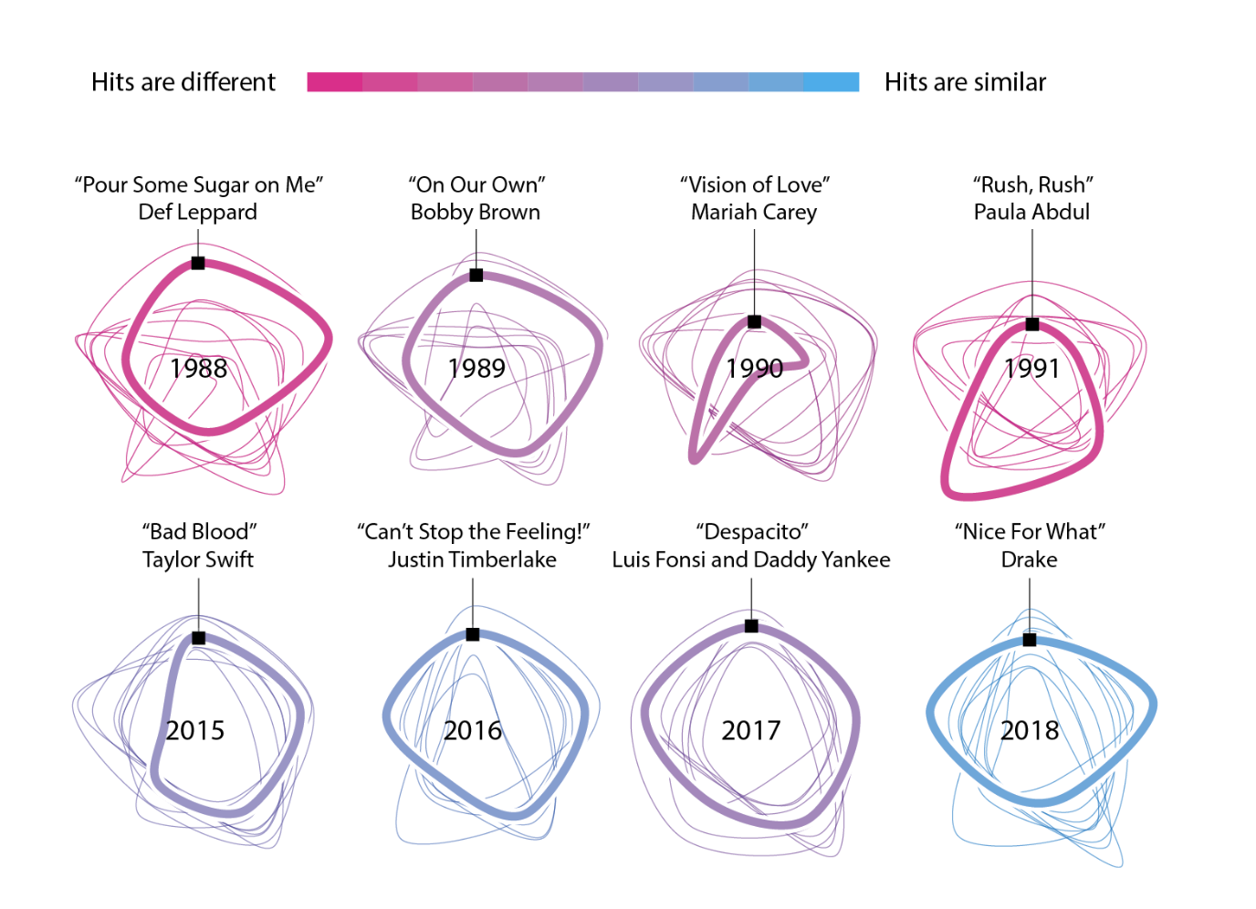
Chart 4 - Interactive radar by year (use Play or the slider)
This radar chart connects the average value of several Spotify features for all tracks in the dataset with that release year (the year in the spreadsheet—not always the year a song first became famous).
Each spoke is on Spotify’s roughly 0–1 scale:
Energy — intensity / activity
Valence — brightness / “positiveness”
Danceability — rhythm suited to dancing
Acousticness — acoustic vs produced sound
Speechiness — spoken-word presence
Liveness — audience / “live” cues
Instrumentalness — vocal vs instrumental
Use the slider to pick a year, or press Play in the chart controls to watch the shape change over time. Tempo and loudness use different units, so they stay in Chart 2.
Limits: Years with very few tracks in this list will jump around more—that’s a small sample, not necessarily “all of rock that year.” Remasters can also shift which year a classic song is tied to.
radar_feats = [
    "energy",
    "valence",
    "danceability",
    "acousticness",
    "speechiness",
    "liveness",
    "instrumentalness",
]
spoke_labels = [
    "Energy",
    "Valence",
    "Danceability",
    "Acousticness",
    "Speechiness",
    "Liveness",
    "Instrumentalness",
]
label_map = dict(zip(radar_feats, spoke_labels))

by_year = df.groupby("release_date", as_index=False)[radar_feats].mean()
by_year = by_year.rename(columns={"release_date": "year"})
long_radar = by_year.melt(
    id_vars=["year"],
    var_name="feature",
    value_name="value",
)
long_radar["value"] = long_radar["value"].clip(0, 1)
long_radar["Spoke"] = long_radar["feature"].map(label_map)

fig = px.line_polar(
    long_radar,
    r="value",
    theta="Spoke",
    animation_frame="year",
    line_close=True,
    range_r=[0, 1],
    title="Average sound profile by release year — Play or drag the year slider",
    category_orders={"Spoke": spoke_labels},
)
fig.update_layout(height=600, title_x=0.5)
fig.show()
Go deeper (no code)
Pick two songs you know from different decades, listen carefully, and jot down how your listening notes compare—or contrast—with what these charts suggest. Optional: read or revisit The fundamentals of sound and discuss how physical sound relates to summary statistics.
Add text here